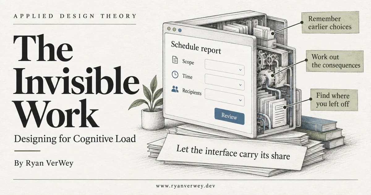
The Invisible Work: Designing for Cognitive Load
A developer's guide to cognitive load: expose hidden mental work, preserve task context, and build interfaces that support understanding without hiding decisions.
Cognitive load is the mental effort involved in processing information. In an interface, that includes understanding what is on the screen, relating it to a goal, and keeping enough context available to act.
Imagine a report-scheduling screen with one dropdown and a Continue button. It looks almost impossible to get wrong. Three steps later, you are asked to confirm the schedule. Which pages did you select? Was that nine in the morning in your time zone or the client's? Did you choose the whole team or one recipient?
The interface has very little on it. Your head is doing the rest.
That is the distinction I want to explore in this fifth article in Applied Design Theory. Reducing visible information does not necessarily reduce mental work. Sometimes it simply moves that work somewhere we cannot see in a screenshot.
As a developer, I find that more useful than treating cognitive load as a synonym for a busy layout. It turns the discussion toward state, dependencies, language, feedback, and recovery: things we can actually design and implement.
A good interface does not remove every difficult decision. It stops making people carry information the product could reliably carry for them.
A Quiet Screen Can Still Be a Demanding Screen
We can inspect spacing, count controls, and remove decorative elements. Those are concrete activities, so they are tempting places to begin. But the effort of using software is not contained entirely within the current viewport.
A person may be translating a label into terminology their organization uses. They may be comparing a monthly price with an annual budget. They may be remembering the selection from an earlier screen while reading an explanation on this one. They may be deciding whether a spinner means the action is still running or has failed.
None of those demands necessarily creates visible clutter.
Consider two versions of the same confirmation step. One says, "Ready to finish?" The other names the selected pages, schedule, time zone, and recipients, with a way to edit each choice.
The second version contains more information. It also gives the person something to verify instead of something to reconstruct. That is a design hypothesis worth testing, not proof that adding summaries always improves usability. A summary can itself be poorly organized, stale, or so exhaustive that the consequential details disappear.
My starting question is therefore not, "Can we remove something?" It is, "What work does the person have to do here, and why are they the one doing it?"
What the Research Actually Gives Us
John Sweller's 1988 paper examined how the demands of conventional problem solving could interfere with learning. A central concern was the processing required to search for a solution versus the development of knowledge structures that support future problems (Sweller, 1988).
That is an educational research foundation, not an experiment comparing two SaaS dashboards. Applying it to interfaces requires judgment. I use the research to ask better questions about mental demands, not to claim that a particular component is scientifically guaranteed to improve conversion.
The theory also gives us distinctions that are more useful than simply calling everything overwhelming.
Intrinsic Load: The Relationships the Task Requires
Intrinsic load concerns the information that must be handled together to understand the material. Its difficulty depends on the interaction between those elements and the person's prior knowledge, not just the number of things displayed (Sweller et al., 2019).
Scheduling a report has real dependencies. The correct recipients depend on its contents. The meaning of a time depends on a time zone. A first-time user may need those relationships explained; an experienced administrator may already understand them.
We cannot make those dependencies disappear by hiding their controls. We can sequence the task, clarify the relationships, and avoid asking for decisions before the information needed to make them is available.
Extraneous Load: Work Added by the Presentation
Extraneous load comes from how information or procedures are presented rather than from the learning task itself (Sweller et al., 2019).
In my interface reviews, I look for analogous avoidable demands: a recipient list on one page and permission information on another; two names for the same setting; an error message that requires hunting for the affected field. Decoration is only one possible source of interference.
The useful boundary is not "content versus styling." It is the distinction between understanding the decision and working around the way we presented it.
A Caution About the Three-Bucket Diagram
You may also encounter germane load. The theory has evolved: the 2019 review discusses germane resources as working-memory resources devoted to dealing with intrinsic load, rather than a separate additive source of load (Sweller et al., 2019).
I would not turn those terms into three dashboard percentages. They are theoretical distinctions, not quantities we can extract from a screenshot. For product work, naming the specific demand is usually more actionable than arguing over its category.
Stop Treating Memory as Free Storage
Suppose we are designing a hypothetical tool that schedules website reports. This is an illustrative workflow, not a description of a measured product experiment.
The user chooses All pages, selects Mondays at 9:00 a.m., and adds the Product team as recipients. A wizard makes each step compact. But if earlier choices disappear, the person must retain them while making later decisions.
Then something interrupts them. They come back, recognize the form, and still do not know whether their remembered choices match the saved ones.
A better candidate design retains a concise summary through the flow and presents it clearly before the action becomes live. The summary does not need to repeat every available option. It needs to represent the choices that determine the outcome.
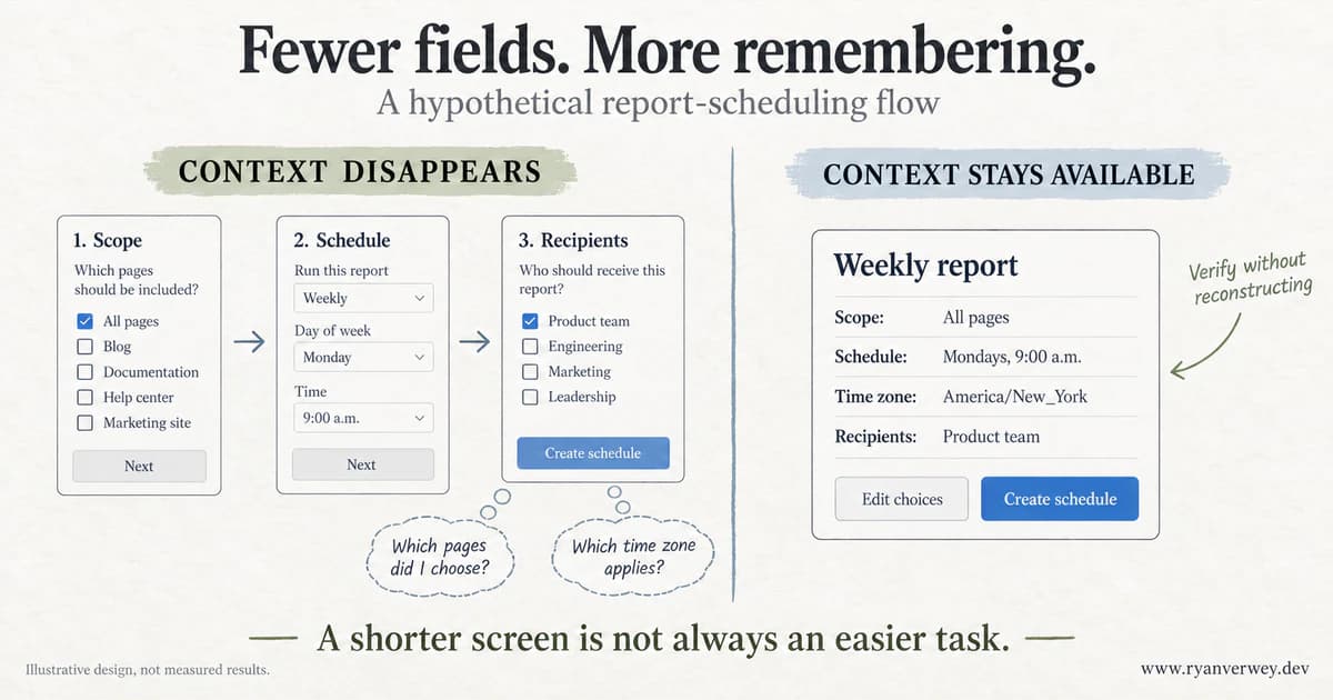
The same scheduling decision can require recall or support verification. This is an illustrative comparison, not a measured performance result.
Notice what changed. We did not remove the time-zone decision. We made its meaning available at the point where the user needs to confirm it. We did not silently choose recipients to save a click. We kept the recipient choice visible.
This aligns with Whitenton's (2013) practitioner guidance to offload appropriate work onto the interface and avoid unnecessary mental processing. My extension is to treat the summary as part of the task's functional contract, not as optional explanatory decoration.
If the submitted values differ from the review, we have not reduced cognitive load. We have made the interface easier to trust than it deserves to be.
The Mental Work Ledger
I use the phrase Mental Work Ledger for a practical review method: write down what a person must locate, interpret, hold, compare, and resume at a particular moment.
This is my own design heuristic, not a validated psychological scale. There are no load points to total and no universal passing score. Its purpose is to make hidden demands specific enough to discuss, implement, and test.
For each demand, record why it exists, whether it serves the person's goal, what the interface currently provides, and what evidence would tell us the support is working.
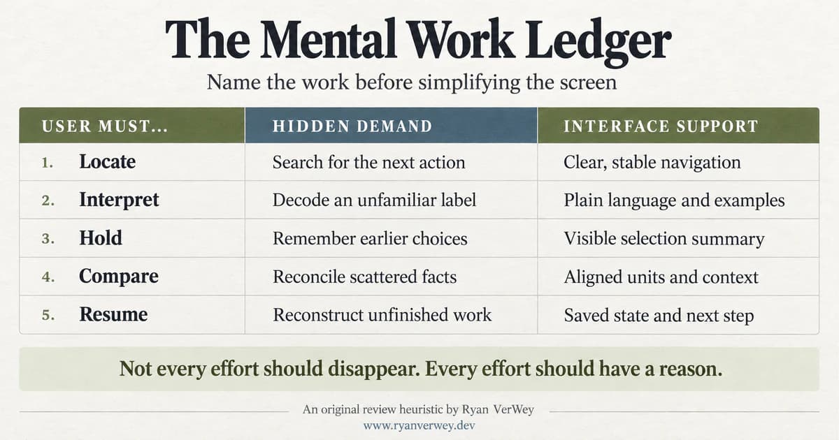
Five questions for reviewing mental work. The categories organize a conversation; they do not measure a person's capacity.
1. Locate: Where Is the Next Useful Thing?
In our scheduling example, the person needs to find the current step, the next action, and the way to revisit a choice. If those move unpredictably, every transition becomes another orientation task.
I would look for stable placement, descriptive headings, and a visible distinction between navigation and commitment. "Continue" moves through setup. "Create schedule" makes something happen. Using the same vague label for both asks the user to infer a difference the product already knows.
The test is not whether someone notices the button. It is whether they can find the next appropriate action and explain what it will do.
2. Interpret: What Does This Mean Here?
A label such as "Scope" may be natural to the development team and unclear to someone scheduling their first report. A short explanation, "Choose which pages this report includes," can connect the label to the task.
The goal is not to eliminate every domain term. Some vocabulary is essential to learning the product. It is to introduce that vocabulary where its meaning is useful, rather than force people to consult another page before they can continue.
Ask participants to describe the setting in their own words. A correct click can conceal an incorrect interpretation.
3. Hold: What Must Stay Available?
The chosen pages, time zone, and recipients influence later decisions. They should not exist only in the user's recollection.
A persistent summary can help, but it must reflect current state. If an edit changes the audience, the review must update. If a value is invalid, the summary should not confidently present it as settled.
I test this by changing an earlier selection and by returning after an interruption. Can the person establish the current configuration from the interface, without reconstructing their previous actions?
4. Compare: Are We Making People Translate?
If one option uses local time and another uses an unspecified system time, we have introduced a conversion problem. If recipient groups are shown by name but their membership is inaccessible, comparison may require another tool.
Put comparable information into compatible terms. Show the relevant unit, time zone, or basis. Keep the consequences of a selection close enough to the choice to be consulted without a scavenger hunt.
Then test the relationship, not just recognition: can the user explain how these options would produce different outcomes?
5. Resume: What Changed While I Was Away?
Returning to a half-finished task is different from starting it. The person needs to recover both the configuration and the status of the action.
"Draft saved. Next: choose recipients" answers two useful questions. "Success" answers neither very well. Was a draft saved, a report generated, or a recurring schedule activated?
A return-state test should establish whether the person can identify what has happened, what remains unfinished, and what action would make the schedule live.
Walk Through the Decision, Not Just the Screens
Here is how I would use the ledger to review our hypothetical workflow before polishing it.
First, define the outcome precisely: the user creates a recurring report for the intended pages, delivered to the intended people at the intended time. "Completes the form" is not an adequate substitute. A confidently misconfigured report is still a failed task.
Next, follow the dependencies. The report's contents affect who should receive it. The time-zone interpretation affects when it arrives. The final review needs both. That tells us which decisions belong together and which information should survive transitions.
Then inspect each change of state. When the user edits the page selection, are dependent settings still valid? When saving fails, are the choices retained? When the user returns, does the interface distinguish the draft from an active schedule?
Finally, choose a small testable change. For example: preserve the selected scope and time zone beside the recipient step, then repeat them in a final review with edit links. The hypothesis is that people can make and verify recipient decisions without navigating backward to recover context.
We would observe whether that happens. We would also watch for a competing problem: perhaps the persistent summary dominates the screen and makes the current task harder to locate. The ledger is not permission to add every helpful-sounding component at once.
This approach changes the design conversation. Instead of defending a layout as "cleaner," we can explain which demand it addresses and how we will know whether it helped.
Progressive Disclosure Can Move the Problem
Progressive disclosure is useful when it postpones information that is genuinely irrelevant to the current decision. It is less useful when it conceals something the person needs in order to make that decision responsibly.
In the scheduling example, an advanced formatting option can probably wait. The recipients and effective time zone should not be hidden behind an accordion on the final confirmation screen simply because the summary looks neater without them.
I separate optional configuration from decision context. Optional configuration can remain available on demand. Decision context needs to be available when the consequence is being evaluated.
The same distinction matters on mobile. Moving the summary to a desktop sidebar does not solve the problem if that sidebar disappears at a narrow breakpoint. A compact inline summary or expandable section with meaningful current values can preserve the relationship without recreating the desktop layout.
This connects to The Shape of Understanding: grouping should expose relationships, not merely put borders around content. A stack of collapsed groups may look organized while still requiring the user to remember what each contains.
Helpful for Whom, and at Which Moment?
The expertise reversal effect describes how instructional techniques that help less experienced learners can become less useful, or counterproductive, as expertise increases (Kalyuga et al., 2003). That research concerns instruction; I treat it as a reason to investigate audience differences, not a rule that all expert users want fewer explanations.
Expertise is also specific. Someone may know React extremely well and still be new to scheduling reports across client time zones. A job title is not a reliable substitute for understanding the task.
For our hypothetical product, I would make basic explanations easy to consult and avoid forcing experienced users through the same introductory material repeatedly. But I would keep consequential state visible for everyone. Knowing the product does not make a stale recipient list safe.
A first-time setup flow might explain the relationship between schedule time and time zone. A repeat visit might present the current setting compactly. Both should allow inspection and correction.
This is where The Novelty Budget remains relevant. Familiar conventions can spare people avoidable interpretation, but familiarity with one convention does not guarantee familiarity with the domain behind it.
Design for Interruption Without Promising Too Much
We often review a flow as though someone will complete it uninterrupted, in the intended order, with a stable connection. That is a useful first path to verify. It is an incomplete product model.
For the scheduling tool, I would define separate draft and active states. Saving a draft preserves authorized information without creating the schedule. Returning to it shows what is preserved and what remains incomplete. Activation is a separate, explicit action.
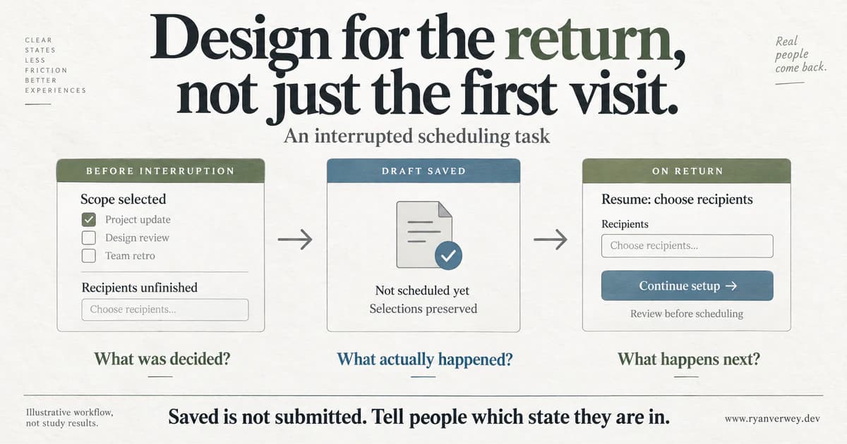
A schematic return journey. Preserving inputs is only part of recovery; the interface must also explain the action's status.
That convenience carries implementation responsibilities. Drafts need an appropriate storage lifetime, access controls, and behavior when permissions change. Shared devices and sensitive recipient data may make some persistence strategies inappropriate. "Remember everything" is not a responsible default.
Within a process, the accessibility guidance is more specific. WCAG 2.2's Redundant Entry criterion addresses information that would otherwise have to be supplied again in the same process, with exceptions including security, essential re-entry, and invalid previous information. It does not require retaining information between sessions (World Wide Web Consortium, 2025).
So I separate two decisions: avoiding unnecessary repeated entry during the task, and offering safe cross-session recovery. Both can support users. They are not the same requirement.
The Frontend Contract Behind the Calm Interface
A reassuring summary is easy to draw. Keeping it accurate across edits, failures, and delayed responses takes engineering work.
For a workflow like this, my implementation review would include these checks:
- Use one authoritative configuration. The review and submission payload should derive from the same current values, rather than separately maintained copies that can drift.
- Represent status explicitly. Draft, saving, save failed, ready to submit, and active are different states. The UI should not collapse them into a generic success indicator.
- Preserve valid input through errors. A failed save should not erase unrelated choices. Explain what failed and what the user can do next.
- Make dependencies visible. If changing scope invalidates another selection, explain the consequence instead of silently replacing it.
- Keep time semantics intact. Store and display the information needed to interpret the schedule, including its time zone, rather than relying on an ambiguous clock label.
- Make feedback perceivable. Associate errors with their fields, maintain a sensible focus order, and provide accessible status feedback. A visual summary alone is insufficient.
These are implementation checks, not a claim that the interface automatically satisfies an accessibility standard. They make the proposed support dependable enough to evaluate.
The same scrutiny applies to AI interfaces. One prompt box can look simpler than a form while asking the user to describe the task, infer what the system understood, and inspect the result for missing constraints. A generated schedule still needs reviewable values and an explicit commitment step.
Changing the input method does not eliminate the responsibility to show what will happen.
Measure Understanding, Not Just Motion
We cannot infer cognitive load from a control count, a screenshot, or one completion-time number.
Paas (1992) investigated subjective mental-effort ratings alongside performance in a study of learning and transfer in statistics. That work supports taking perceived effort seriously as evidence; it does not give us a universal product score or a direct reading of someone's remaining mental capacity.
For our workflow, I would combine several observations: whether the final configuration is correct, whether the person can explain it, where they backtrack or seek help, whether they can recover after an interruption, and how effortful they report the task to be.
Keep task conditions and participant experience in view. Comparing a novice handling a complex report with an expert handling a routine one does not isolate the interface's contribution. A useful comparison needs equivalent goals and attention to relevant experience.
I would also resist declaring victory because the new version is faster. Perhaps it supports understanding. Perhaps it encourages people to skip the recipients and accept a default. A brief explanation of the intended outcome can help distinguish those possibilities.
This is the same discipline discussed in The Confidence Trap: an observable result and our preferred explanation are not the same thing.
Keep the Effort That Protects the Decision
Some effort belongs in the experience. Reviewing who will receive a report is not a nuisance merely because it slows completion. Understanding a permission change is not wasted time.
I want to remove the effort of finding scattered facts, not the opportunity to consider their consequences. I want to reduce avoidable recall, not replace consent with an invisible assumption.
That distinction also connects to The Decision Tax. Fewer choices can help in some circumstances, but narrowing the visible set is not enough if users can no longer establish whether the remaining options meet their needs.
The practical aim is a better division of labor: the system retains reliable state and presents relevant relationships; the person evaluates goals, tradeoffs, and consequences. Neither side should be asked to do the other's job by accident.
Final Takeaway
The next time an interface feels demanding, resist beginning and ending with the amount of content on the screen.
Follow the task. Find the moment someone has to remember a vanished choice, translate an ambiguous label, reconcile incompatible units, or guess whether an action succeeded. Name that demand. Decide whether it contributes to the goal. Then provide support and test whether it actually helps.
A visually simple interface can still leave a person doing substantial invisible work. A more informative interface can make the same decision easier to understand and verify.
The goal is not an empty screen. It is a person who can tell what they are doing, why it matters, and what will happen next.
References
Kalyuga, S., Ayres, P., Chandler, P., & Sweller, J. (2003). The expertise reversal effect. Educational Psychologist, 38(1), 23-31. https://doi.org/10.1207/S15326985EP3801_4
Paas, F. G. W. C. (1992). Training strategies for attaining transfer of problem-solving skill in statistics: A cognitive-load approach. Journal of Educational Psychology, 84(4), 429-434. https://doi.org/10.1037/0022-0663.84.4.429
Sweller, J. (1988). Cognitive load during problem solving: Effects on learning. Cognitive Science, 12(2), 257-285. https://doi.org/10.1207/s15516709cog1202_4
Sweller, J., van Merriënboer, J. J. G., & Paas, F. (2019). Cognitive architecture and instructional design: 20 years later. Educational Psychology Review, 31, 261-292. https://doi.org/10.1007/s10648-019-09465-5
Whitenton, K. (2013, December 22). Minimize cognitive load to maximize usability. Nielsen Norman Group. https://www.nngroup.com/articles/minimize-cognitive-load/
World Wide Web Consortium. (2025, September 17). Understanding Success Criterion 3.3.7: Redundant entry.
Frequently Asked Questions
What is cognitive load in UI/UX design?
Cognitive load concerns the mental effort required to process information. In interface use, relevant demands include understanding labels, relating information to a goal, remembering earlier choices, and evaluating what an action will do. Visible complexity is only part of that experience.
Does reducing cognitive load mean showing fewer options?
Not necessarily. Removing irrelevant options may help, but hiding essential context can increase recall and navigation demands. Decide what information the current decision requires before deciding how little to display.
Does Miller's Law mean a screen should have seven items?
No. A memory-capacity discussion is not a universal limit for menus, fields, or dashboard components. The task, relationships between information, presentation, and user's knowledge matter. Our chunking article explores why meaningful grouping is more useful than an arbitrary item count.
How can a team evaluate whether a redesign reduced unnecessary effort?
Use representative tasks and combine correct outcomes, comprehension, observed difficulties, recovery behavior, and self-reported effort. Compare equivalent conditions and account for experience. Faster completion alone does not establish better understanding or lower cognitive load.
Is the Mental Work Ledger a scientific assessment?
No. It is an original review heuristic for identifying demands and proposing testable support. It does not diagnose users, calculate memory capacity, or replace research with the people who will use the product.
Share this article

Ryan VerWey
Full-stack developer, Army veteran, and founder of Echo Effect LLC. His experience timeline documents current Ratespedia CTO work, Department of War contractor work, and prior Army service. More about Ryan or see the work.
Recommended Reading
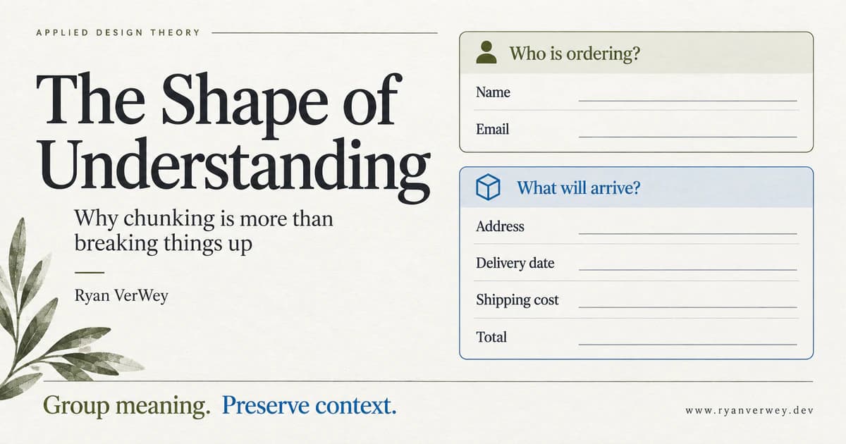
The Shape of Understanding: Why Chunking Is More Than Breaking Things Up
Chunking is more than dividing content into cards. Learn to group meaning, preserve context, and test whether your interface helps people understand.
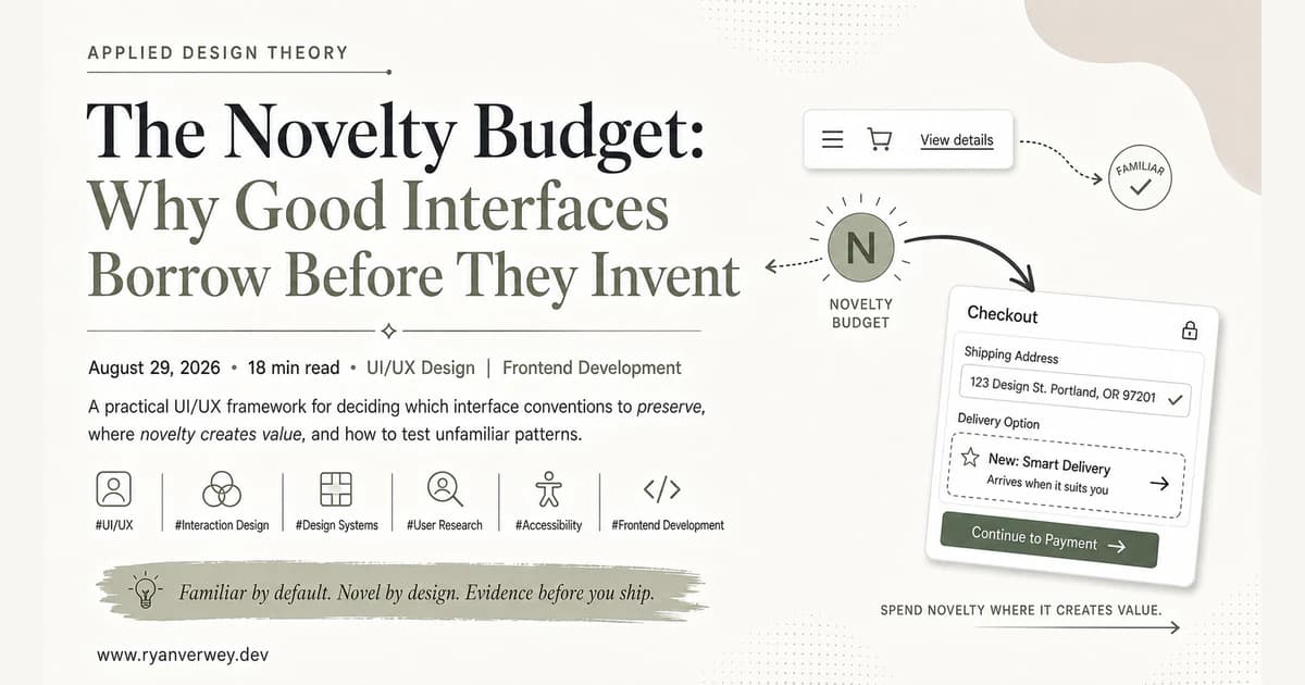
The Novelty Budget: Why Good Interfaces Borrow Before They Invent
A practical UI/UX framework for deciding which interface conventions to preserve, where novelty creates value, and how to test unfamiliar patterns.
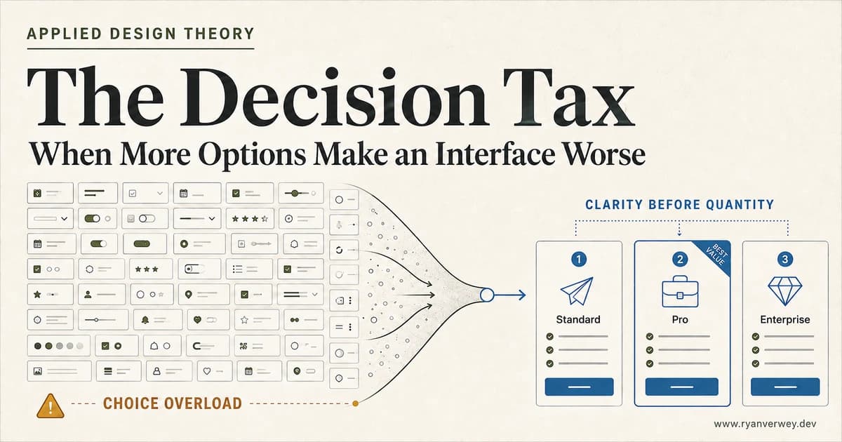
The Decision Tax: When More Options Make an Interface Worse
Choice overload is not a magic number. Learn how to structure options, comparisons, defaults, and filters so users can choose with confidence.