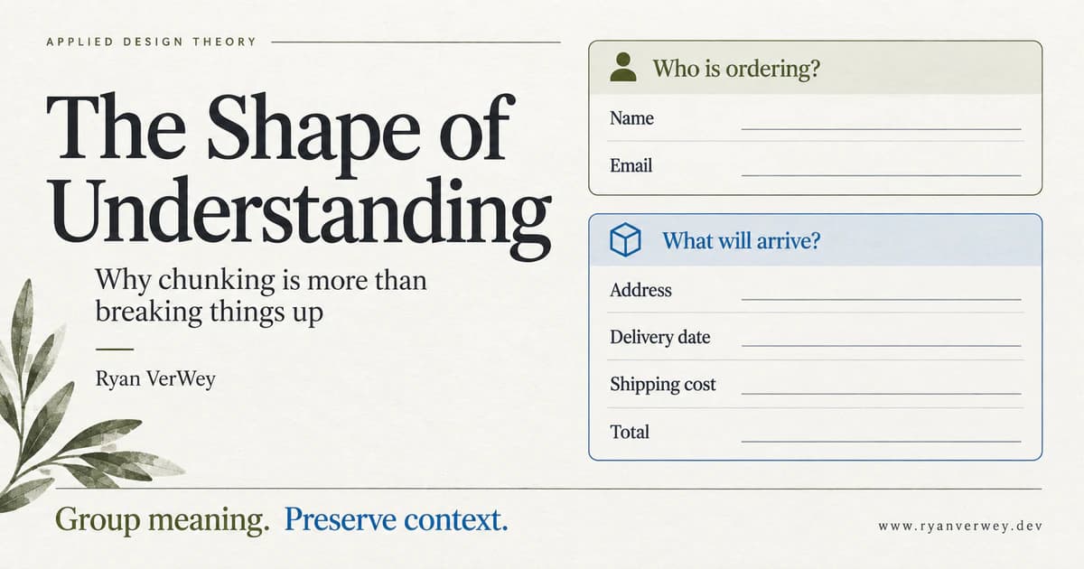
The Shape of Understanding: Why Chunking Is More Than Breaking Things Up
Chunking is more than dividing content into cards. Learn to group meaning, preserve context, and test whether your interface helps people understand.
Chunking means organizing individual pieces of information into meaningful units. In an interface, the useful part is not simply making those units smaller. It is helping someone understand what belongs together, what it means, and what they can do with it.
A screen can have generous spacing, neat cards, and very little text while still being hard to understand. Each detail might be readable on its own. The problem is that the visitor has to assemble the explanation.
Imagine a subscription screen that puts the monthly rate in one panel, the number of seats in another, and the billing interval behind a dropdown. Everything looks organized. Yet answering "What am I about to pay?" requires a small investigation.
That is the distinction I want to explore: breaking information apart is a layout operation; putting meaning within reach is a design responsibility.
In this third article in Applied Design Theory, I am treating chunking as a problem of boundaries. Where should a group begin? What belongs inside it? What relationship must survive when the layout changes? And how do we know that our tidy arrangement makes sense to someone who did not build it?
A Border Is Not a Meaning
As a developer, I can create a reusable card component before I know what the card ought to represent. Give it a title, a body, and some actions, and almost anything can go inside.
That flexibility is useful for implementation. It is not a content strategy.
Consider an order confirmation grouped into three sections: Numbers, Text, and Status. The date and price fit under Numbers. The delivery method and address fit under Text. Payment confirmation fits under Status. It is a consistent classification, but it answers a question about the data rather than the order.
The customer has a different question: "What happens to my order?"
A summary that brings arrival date, shipping method, destination, total, and payment state together gives those facts a shared purpose. Nothing has been removed. The relationship has been made explicit.
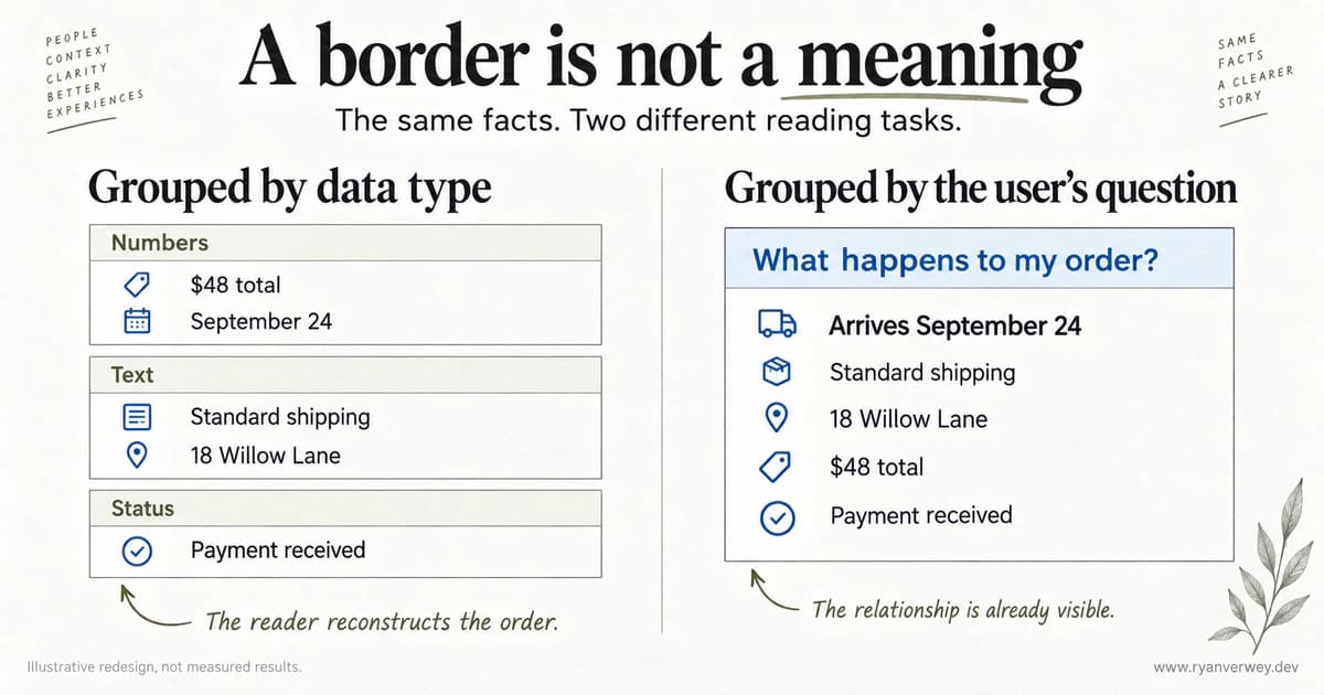
An illustrative redesign, not a usability-study result. The change is the organizing principle, not the amount of information.
This is my starting test for a proposed chunk: can I explain why these particular things belong together without mentioning their color, component type, or position?
If the answer is "They all help someone verify the delivery," there is a meaningful unit to design. If the answer is "We needed three equal columns," the layout may be driving the wrong decision.
What Miller Actually Gives Us
George A. Miller's 1956 paper examined limits in information processing, including immediate memory and absolute judgment. A central idea was recoding: familiar relationships allow multiple pieces of information to be represented as a larger unit. The amount of information in a chunk matters, not just the count of raw symbols (Miller, 1956).
That is more interesting for design than the famous number in the title. It also requires more care. Miller was not establishing a maximum number of navigation links, form fields, or dashboard tiles. Translating a memory experiment directly into a page-layout quota changes the task being studied. Read Miller's original paper.
Later, Cowan (2001) reviewed evidence for a smaller capacity, averaging roughly four chunks under conditions that constrain rehearsal and recoding. The boundary conditions are essential to that argument. It is not a replacement rule telling designers to put four things on every screen. Read Cowan's review.
My design conclusion is deliberately narrower: do not make an interface depend on people holding disconnected facts in their heads when the interface could keep those facts available.
There is a difference between remembering a set of options after they disappear and scanning a list that remains visible. Before invoking a memory limit, identify which task your user is actually performing.
Three Different Things We Call a Chunk
I find it useful to separate three layers during a design review. This is a working distinction for evaluating an interface, not a new psychological taxonomy.
A visual group says, "These elements are presented together." It might be established through a heading, spacing, alignment, or a container.
A task group says, "These details help answer the same question." An invoice's amount due, due date, and payment action form a useful task group even though the underlying data types differ.
A learned mental chunk is a unit the person already recognizes through knowledge or experience. A developer might read an HTTP method and route as one familiar operation. Someone encountering an API for the first time may need to understand each term separately.
These layers can reinforce each other, but they are not interchangeable. Putting unfamiliar configuration settings inside one rectangle does not instantly make them one easy-to-process idea.
Moran (2016) distinguishes the memory concept from the broader UX use of chunking to describe meaningful, visually distinct content units. Her practical guidance connects grouping with scanning while warning against using the number seven to cap menus. I use that distinction here: better scanning is a useful design goal, but it is not proof that a visual group has become a single unit in memory. Moran's explanation.
Your Expertise Can Hide the Missing Explanation
Chase and Simon's (1973) research on chess perception investigated how players of different skill levels organized positions into chunks. Their work links skilled performance to learned patterns and relationships, rather than a generally superior ability to remember any arrangement of pieces. It is evidence about chess expertise, not a direct experiment on website layouts. Read the study.
The interface implication I draw is that the designer's meaningful unit may still be several unresolved questions for the visitor.
A settings group called "Delivery infrastructure" might seem clear to the engineer who implemented it. Inside are domains, DNS records, sending identities, and retry policies. A small-business owner trying to send a receipt may not know which setting affects which part of the process.
For that audience, I would start with questions such as "What address will customers see?" and "Is this domain ready to send?" Technical details can remain available. The grouping should make an entry point possible without requiring the implementation model first.
The opposite mistake is treating experienced operators as permanent beginners. A specialist comparing many records may prefer a compact table to a sequence of large explanatory panels. The goal is not maximum explanation everywhere. It is the right relationship made legible for the audience and task.
That connects to The Novelty Budget: familiarity is not only about recognizable buttons. It also includes the concepts people bring to a product. Borrow those concepts carefully, and verify that your audience actually has them.
Find the Smallest Complete Answer
My preferred unit for designing content is the smallest complete answer. That phrase is a design heuristic, not a measured cognitive capacity.
It means a group contains enough information to answer one useful question without sending the reader elsewhere for an essential qualification.
Take a scan report. A heading that says "Critical issues: 12" supplies a count, but not necessarily a useful answer. A repair-oriented group might identify the issue, show an affected page, explain the evidence, and describe the next action. Those details form a complete unit for deciding whether and how to investigate.
That group is larger than a statistic tile. It may also require less reconstruction work.
I would not put every occurrence, implementation note, and historical comparison into the same initial view. Completeness is relative to the current question. "What should I investigate next?" needs different detail from "How did this issue change across six releases?"
Here is how I would choose boundaries for a hypothetical website audit report:
| Reader's question | Keep together | Detail that can follow |
|---|---|---|
| What needs attention first? | Issue, severity, affected scope, reason for priority | Full occurrence list |
| Is the finding relevant here? | Page URL, observed evidence, applicable condition | Methodology notes |
| How can I verify a repair? | Expected result, check steps, limitations | Historical scan comparison |
These are proposed groupings, not claims about any particular tool's measured effectiveness. Their value is that someone can disagree with them in useful terms: perhaps scope is essential earlier, or a limitation must be shown beside the severity. That is a better conversation than arguing about card padding.
Boundaries Can Also Create Work
Every group has an inside and an outside. When we draw a boundary, we make an argument that the contents belong together and the neighboring content is different.
Sometimes that argument is wrong.
On a subscription checkout, separating plan selection from seat quantity may be reasonable. Hiding the selected rate when someone reaches confirmation is not. The choice depends on the relationship between price basis, quantity, interval, and total.
In the example below, five seats at $20 per seat per month produce a $100 monthly total before any tax. The arithmetic is simple. The design question is why the user should have to reconstruct it.
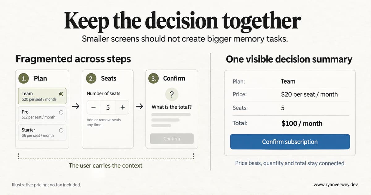
The summary preserves the facts needed to authorize a purchase. The pricing and layouts are illustrative, not results from a product experiment.
I call unnecessary reconstruction across group boundaries reassembly work. This is my own term for a review concern, not a standardized metric. Look for the moments when someone must remember a value, reopen a section, or mentally reconcile labels that should have been connected.
A multi-step flow can reduce the amount presented at once while increasing reassembly work. Both can be true. The number of visible fields is therefore a weak measure of simplicity by itself.
Keep a compact summary where it helps. Repeat important context intentionally. Let people edit a prior choice without losing the rest of their work. An extra line of accurate context may be better than a cleaner screen that leaves the commitment ambiguous.
Disclosure Is Not the Same as Organization
An accordion creates a visibility boundary. A tab creates a navigation boundary. Neither guarantees a useful conceptual boundary.
I would use disclosure when a person can predict what is inside and does not need that information to interpret the visible content. Troubleshooting details for an uncommon error might fit. The recurring price of a subscription does not belong behind an unexplained "More" control beside a purchase button.
A useful review exercise is to read only the collapsed labels. Do they let someone locate the answer, or merely announce vague categories such as General, Additional, and Other?
Then open the sections in the order a real task requires. If answering a basic question means repeatedly switching between mutually exclusive panels, consider keeping those details together or allowing multiple panels to remain open.
In The Decision Tax, I argued that choice support matters more than a universal option limit. The same principle applies here. Hiding choices does not automatically make them easier to evaluate. Breaking information apart does not automatically make it easier to understand.
Writing Is Part of the Layout
A heading is a promise about what follows. If it says "Before you connect your account," the section should explain prerequisites or consequences needed before that action. If it begins with product history and ends with a warning about permissions, the group has not kept its promise.
For a technical guide, I would organize the initial setup around distinct reader questions: what access is required, what the command changes, what success looks like, and how to recover from failure. A code block without those boundaries can be syntactically precise and operationally unclear.
Paragraph length should follow the argument, not a word quota. A short paragraph can introduce a claim. Another can explain a limitation. A numbered list suits a sequence. A table suits repeated comparison dimensions. They are different reading structures, not interchangeable ways to make a page look lighter.
There is also a point where fragmentation damages the argument. If every sentence becomes a callout, nothing establishes priority. If every qualification becomes a separate section, readers must travel back and forth to understand a single claim.
My editing test is to read the headings without the body, then read each section with its heading removed. The first pass tests the route through the article. The second asks whether the content actually holds together. A section that needs three unrelated headings probably contains three different jobs.
A Component Boundary Is Not a User Boundary
Atomic component design helps a team reuse behavior and styling. It does not tell us which information should travel together for a reader.
An application can render an order summary from several small components while presenting it as one coherent answer. Conversely, one large React component can contain several meaningful sections. The implementation tree and the information hierarchy serve different purposes.
When building a reusable summary, I would define the content contract alongside the props. What makes this summary complete? Which labels are required? What happens when a value is unavailable? Is a missing total shown as loading, unavailable, or accidentally omitted?
The failure state deserves particular attention. Suppose a delivery estimate loads separately from the rest of an order. Leaving a blank line can make the group look finished when it is not. A specific state such as "Delivery estimate unavailable" preserves the meaning of the group more honestly than an empty space.
I would also check whether the visible grouping survives without styling. W3C's form guidance recommends grouping related controls both visually and programmatically, including fieldset and legend for appropriate control groups (World Wide Web Consortium, n.d.). A border alone does not provide that relationship to assistive technology. W3C's grouping guidance.
For a delivery-method choice, the group label should identify the question, while each option has its own clear label. Elsewhere, use headings, lists, and tables according to the content rather than assigning a generic group role to every container. Semantic structure should express the relationship, not imitate a screenshot.
Mobile Should Change the Arrangement, Not the Meaning
Responsive design is where weak grouping decisions become especially visible.
On a wide screen, a selected plan and its total might sit beside each other. At a narrow width, stacking entire columns could put several unrelated sections between them. The desktop screenshot still looks reasonable, but the mobile reading order has separated the answer.
I would review the narrow layout in task order: choose a plan, adjust quantity, inspect cost, confirm. The related context should appear at the point where it is needed. The original two-column arrangement has no special right to survive.
A persistent summary can help, but it can also consume too much of a small viewport. A compact inline summary near the action may be the better tradeoff. Test the actual content with zoom, long labels, validation messages, and the on-screen keyboard rather than assuming that one sticky pattern solves every case.
This applies to the article's diagrams, too. Their essential lessons are also expressed in the surrounding text and descriptive alternatives. An image should illustrate the explanation, not be the only place a reader can obtain it.
The BOUND Review
To turn these questions into a repeatable critique, I use BOUND: Begin with the question, Organize relationships, Use informative labels, Notice dependencies, and Demonstrate comprehension.
This is my synthesis for design and engineering reviews. It is not a validated psychological scale, a numerical score, or a claim that five is the correct number of anything.
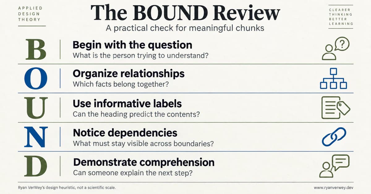
Use the review to explain and test a boundary, not to count the objects inside it.
Begin With the Question
Write the question the person is trying to answer before naming the component. "Can I change this booking without paying a fee?" is more useful than "We need a booking card."
Specify the audience and moment, too. Someone comparing bookings and someone changing an existing reservation may need different groups even when the underlying data is identical. If the team cannot agree on the question, polishing the container is premature.
Organize Relationships
Identify the facts needed together to answer that question. For a booking change, that might include the current reservation, eligible alternatives, fee conditions, and the resulting price.
Then inspect the proposed group for intruders. A promotional offer might be related to the business but unrelated to the immediate decision. Being available in the same API response is not a reason for two facts to share a presentation group.
Use Informative Labels
Give the group a name that helps people predict its contents. "Change fees" is a stronger location cue than "Important information" when the reader is looking for a cancellation cost.
Try the label outside the layout: in a navigation list, an error message, or a support conversation. If it only makes sense beside a particular icon, the wording is probably carrying too little of the meaning.
Notice Dependencies
Draw the connections that cross your proposed boundaries. Does a later choice alter an earlier total? Does a setting depend on a permission explained elsewhere? Does an exception change the meaning of the headline?
These connections are not automatically reasons to merge everything. They are reasons to preserve context deliberately. A summary, a clear reference, or a revised sequence may keep the interface understandable without creating one enormous section.
Demonstrate Comprehension
Ask someone to use the interface and explain the result in their own words. Can they identify the applicable fee, predict the next step, and say what will change after confirmation?
Do not settle for a preference vote between screenshots. A person can prefer the tidier version while misunderstanding a condition. The purpose of the review is to discover whether the organization supports the task, not whether the team likes its visual rhythm.
Test Understanding, Not Just Speed
For a hypothetical checkout test, I would give participants a specific goal: choose five seats, determine the recurring cost, and explain what they are authorizing. Keep the underlying facts equivalent between versions so a missing price or a rewritten offer does not confound the comparison.
Observe where they look, which sections they reopen, and whether they reach the right interpretation. Record incorrect answers and uncertainty as well as completion time. A fast confirmation based on the wrong billing assumption is not a successful design outcome.
I would include both people familiar with per-seat billing and people who rarely purchase software. The point is not to average away their differences. It is to discover whether a group that feels obvious to one audience requires explanation for another.
If the study includes an interruption, make it consistent across versions. Ask participants to resume the task and see whether the visible context helps them recover. Report that as an observation from this task, not a universal percentage improvement in cognition.
For an article or knowledge base, use a different test: ask readers to find a specific answer, identify its limitation, and choose an appropriate next action. Time on page alone cannot tell you whether someone was engaged, lost, or interrupted.
Agree on the important failures before testing. A team should know whether the priority is finding an answer, understanding a commitment, preventing a dangerous mistake, or supporting repeated expert work. Otherwise, it is too easy to call whichever metric improved the definition of success.
Final Takeaway
The most useful question is not "How many things fit in a chunk?" It is "What can someone understand because these things are together?"
Start with the reader's task. Make relationships explicit. Write labels that predict the contents. Keep qualifications close to the claims they change. When a flow crosses a boundary, carry the necessary context with it.
Miller gives us a reason to take meaningful organization seriously. He does not give us a universal grid specification. A beautiful container cannot supply knowledge the reader does not have, and a shorter screen is not automatically a simpler experience.
Good chunking makes the structure of the information useful. It helps a person find an answer, see how the parts relate, and continue without rebuilding the whole picture in their head.
That is the shape of understanding worth designing for.
References
Chase, W. G., & Simon, H. A. (1973). Perception in chess. Cognitive Psychology, 4(1), 55-81.
Cowan, N. (2001). The magical number 4 in short-term memory: A reconsideration of mental storage capacity. Behavioral and Brain Sciences, 24(1), 87-114.
Miller, G. A. (1956). The magical number seven, plus or minus two: Some limits on our capacity for processing information. Psychological Review, 63(2), 81-97.
Moran, K. (2016, March 20). How chunking helps content processing. Nielsen Norman Group.
World Wide Web Consortium. (n.d.). Grouping controls. Web Accessibility Initiative.
FAQ
What is chunking in UI/UX design?
Chunking organizes information into meaningful, distinguishable units. In an interface, those units should help people locate an answer and understand relationships. A visual container can support that goal, but a collection of unrelated facts does not become meaningful simply because it has a border.
Does Miller's Law mean a screen should contain only seven items?
No. Miller's work on memory and information processing does not establish a seven-item screen limit. Evaluate whether people need to remember information, recognize visible options, compare facts, or learn a concept. Those tasks call for different design decisions.
What is the difference between chunking and progressive disclosure?
Chunking concerns which information belongs together. Progressive disclosure concerns when information becomes visible. They can work together, but hiding details is harmful when those details are needed to understand the current decision.
How can I tell whether my groups are useful?
State the question each group answers, check that its heading predicts the contents, and identify dependencies that cross its boundaries. Then observe people completing a realistic task and explaining the result. The BOUND review provides a practical structure for that process.
Should every chunk be a card?
No. A heading and well-organized text, a form fieldset, a list, or a table may express the relationship more clearly. Choose the structure that supports the reading or interaction task rather than turning every section into a repeated visual container.
Share this article

Ryan VerWey
Full-stack developer, Army veteran, and founder of Echo Effect LLC. His experience timeline documents current Ratespedia CTO work, Department of War contractor work, and prior Army service. More about Ryan or see the work.
Recommended Reading
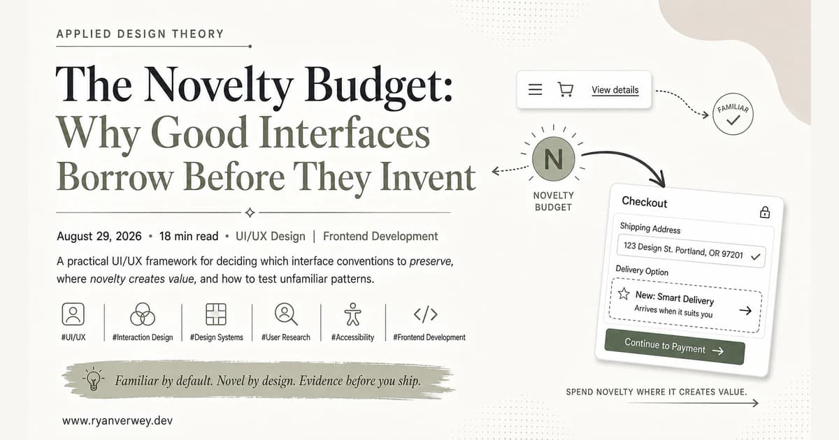
The Novelty Budget: Why Good Interfaces Borrow Before They Invent
A practical UI/UX framework for deciding which interface conventions to preserve, where novelty creates value, and how to test unfamiliar patterns.
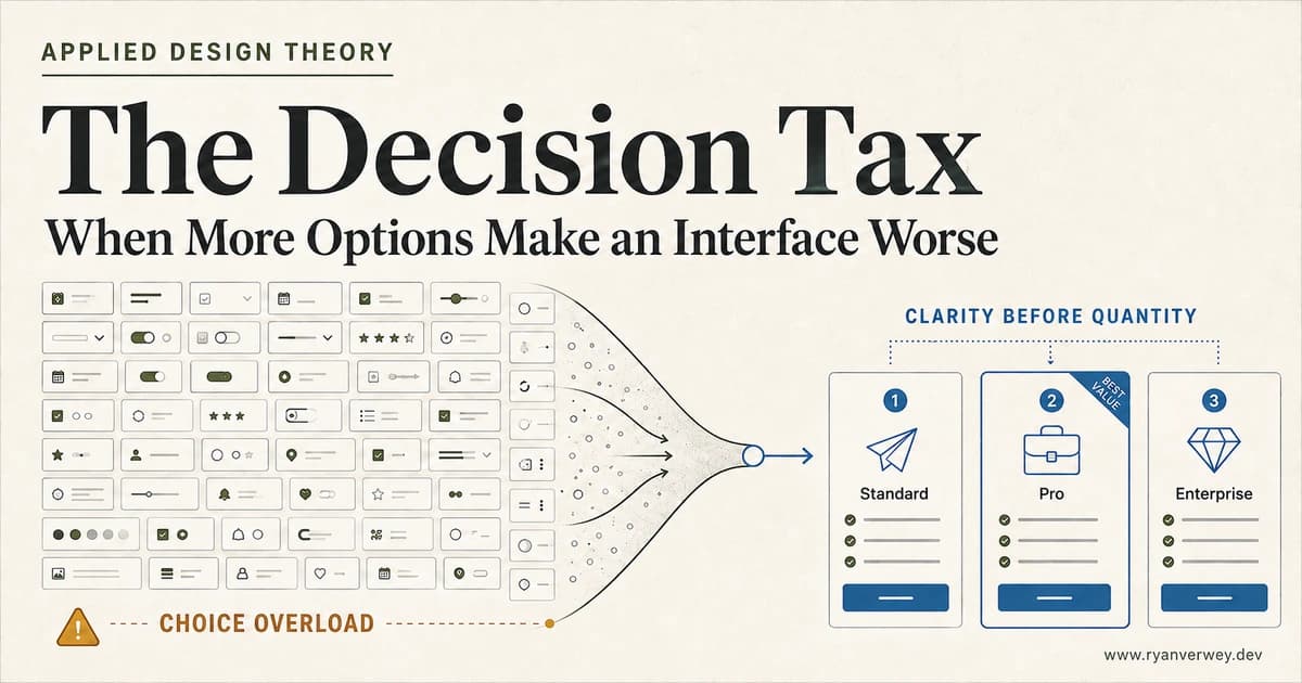
The Decision Tax: When More Options Make an Interface Worse
Choice overload is not a magic number. Learn how to structure options, comparisons, defaults, and filters so users can choose with confidence.
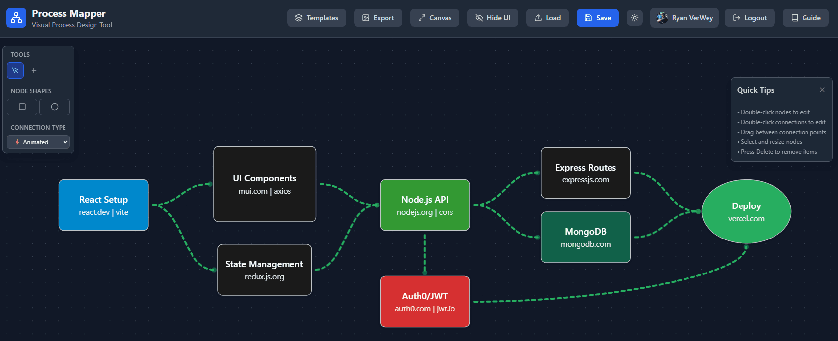
Process Mapper: Building an Interactive Workflow Visualization Tool
Explore Process Mapper, a drag-and-drop workflow visualization tool covering architecture, interaction design, state management, and process mapping UX.