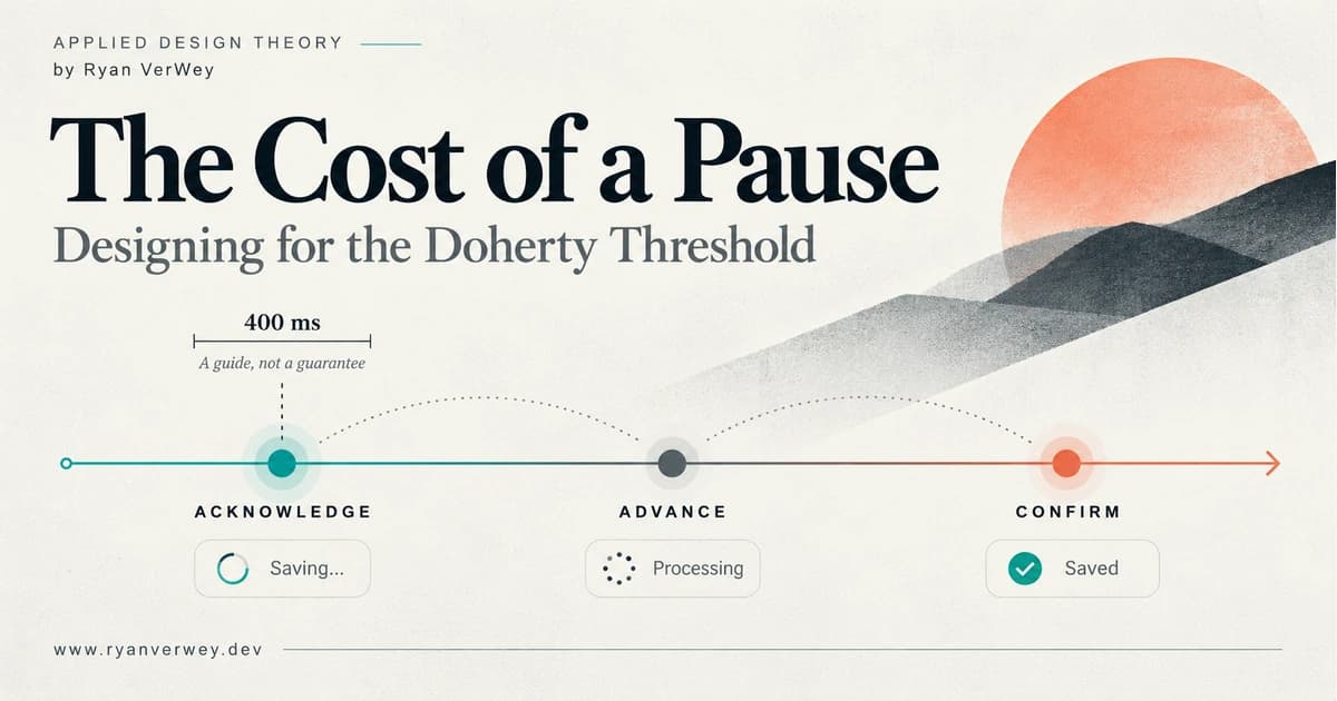
The Cost of a Pause: Designing for the Doherty Threshold
A developer's guide to the Doherty Threshold: build responsive feedback, honest progress, and reliable recovery without confusing speed with completion.
The Doherty Threshold is a response-time principle commonly summarized as keeping computer feedback below roughly 400 milliseconds so people can maintain their working rhythm. Its useful lesson is that the pause between an action and a meaningful response is part of the user experience, not simply a backend performance number.
Click Save. Nothing changes.
You wait a moment. Did the click register? You click again. Now the button says "Saving," but the page still shows your previous settings. You open another tab to check. When you return, a notification says "Success." Success for which version?
The system might have completed its work correctly. It has still made you supervise the transaction.
That is the problem I want to examine in this sixth article in Applied Design Theory. We have discussed familiarity, choice, grouping, bias, and mental effort. Response time connects those ideas to the moment software either supports our next action or makes us stop and investigate.
As a developer, I am interested in both the milliseconds and the meaning of the response. A quick animation can acknowledge a click. It cannot establish that a payment cleared, a report exists, or a change was saved.
A responsive interface gives people timely evidence about what happened and a dependable way to continue.
The Pause Costs More Than Its Duration
Imagine a hypothetical reporting tool. A team member filters a list, selects several records, requests an export, and sends the resulting file to a colleague. Each action depends on the one before it.
When the filter takes effect clearly, the person can inspect the results. When the selection remains visible, they can verify the export scope. When the export becomes available, they can finish the task.
Now insert an ambiguous pause after each step. The list does not visibly acknowledge the filter. The selection count updates late. The export button stays enabled after activation. A spinner eventually appears without identifying what it is doing.
There is processing time in this experience, but there is also interpretation time. The person has to decide whether to wait, repeat the action, or investigate elsewhere. Those are additional decisions that the product introduced.
This connects directly to The Invisible Work. Unclear feedback asks people to remember what they attempted while inferring the current state from incomplete evidence. The screen can remain visually simple while the task becomes difficult to follow.
My design question is: What does the person have enough evidence to do next? A response that leaves that question unanswered has limited value, however quickly it appears.
What the Historical Research Actually Supports
Doherty and Thadhani's (1982) IBM report described relationships between faster system responses and improved productivity in interactive computing. Its definition of system response covered the interval from a command to the display of a complete response. It discussed several work settings and argued that delays could disrupt the sequence of actions people intended to carry out.
The report is useful historical evidence for taking subsecond interaction seriously. It is not a controlled trial of modern web applications, and its reported gains should not become a conversion forecast for a new checkout page. The source linked here is a reproduction of the report, rather than a claim to have inspected an original journal issue.
The familiar 400-millisecond formulation appears in contemporary UX guidance such as Yablonski's (n.d.) description of the Doherty Threshold. I treat it as a useful prompt to examine responsiveness, not a biological switch that flips between productive and unproductive at exactly 400 milliseconds.
Related guidance also uses other time ranges. Nielsen (1993) discusses approximately 0.1 seconds for a sense of immediate response, one second for continuity of thought, and ten seconds as a point at which attention becomes difficult to sustain. These are design guidelines, not permission to leave an interface silent until a timer expires.
For a drag interaction, 400 milliseconds would be a conspicuous lag. For a large report, completing all the work within that interval may be unrealistic. The task determines what a useful response must contain.
Three Clocks Are Running
For implementation reviews, I separate three intervals: time to acknowledgment, time to useful progress, and time to confirmed completion. This is my own practical distinction, not a replacement for a standardized performance metric.
Acknowledgment tells the person that their action reached the interface. The button changes state, the selected filter becomes visible, or a message identifies the pending request. It should happen promptly and should describe only what is known.
Useful progress gives the person evidence that advances the task. Search results become available. An export enters a confirmed queue. A job reports that it has processed a particular number of records. A decorative spinner does not, by itself, establish any of those facts.
Confirmed completion means the promised outcome is actually available. A report can be downloaded. A saved configuration can be read back. A server has confirmed the state on which the next action depends.
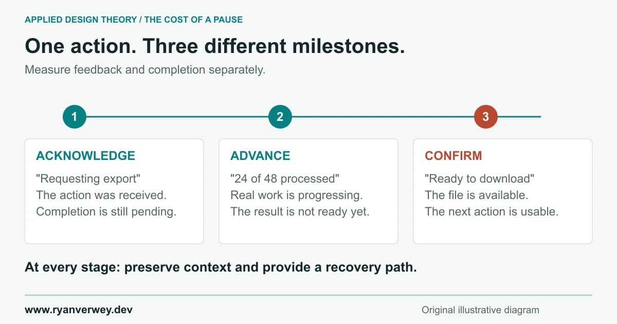
These are conceptual milestones, not a measured latency chart. Acknowledgment can precede completion without pretending to be completion.
A team can improve the first interval and leave the third unchanged. That may still help users understand what is happening. It should be described honestly as better feedback, rather than a claim that the export itself became faster.
Separating the intervals also makes failures easier to discuss. "The API is fast" does not explain why the button stayed unresponsive. "The spinner appeared immediately" does not explain why the report never arrived.
The Response Contract
I use Response Contract as a review heuristic for the promises an interface makes after an action. It has four parts: acknowledge, advance, confirm, and recover. It is an original organizing method for this article, not a validated psychological scale.
1. Acknowledge What You Received
In our reporting example, the initial message might be "Requesting export for 48 selected records." That tells the person what the interface is attempting. "Export queued" should wait until the service has actually accepted the job.
Keep the selected scope visible. If the button simply becomes a spinning icon, the user loses information at the exact moment they want reassurance. A short label can preserve the connection between the action and its purpose.
Also decide which controls should remain available. Preventing repeated submission can be sensible. Freezing the entire application because one export is pending usually needs a stronger justification.
2. Advance With Evidence
Once the job is accepted, show the state the system can support: queued, processing, or preparing the download. If there is a reliable completed-unit count, present it with a clear denominator.
Avoid telling a story the backend cannot substantiate. A timed sequence that says "Analyzing," "Validating," and "Finishing" regardless of what the service is doing is a presentation script, not operational visibility.
The user does not need every internal event. They need enough trustworthy information to understand whether waiting still makes sense and whether they can work elsewhere.
3. Confirm the Actual Outcome
"Ready to download" should mean the file is ready. If generation succeeded but delivery failed, say so and expose a recoverable path. An all-purpose "Done" message hides distinctions the user may need immediately.
Where the outcome matters later, leave a durable record. An export entry with its scope, creation time, and download action is more useful than a toast that disappears before the person returns from another tab.
The confirmation should connect to the original request. If a user changed the selection while an export ran, the resulting file must still identify the scope captured when that job was submitted.
4. Recover Without Making People Guess
A timeout is especially revealing. It may mean the browser stopped waiting while the server continued working. Declaring the operation failed and encouraging an unconditional retry can create a second job.
For a service that supports it, retain an operation identifier and check status before creating another request. Show "We couldn't confirm the export status" when that is the fact you have. Preserve the person's selections and explain the available next step.
Recovery belongs in the contract from the start. It cannot be designed well as a generic error toast added after the successful path is finished.
Choose Feedback by What You Know
The loading component should follow the evidence available about the operation. Beginning with a favorite spinner and writing the state model afterward reverses that relationship.
A pending label suits a short action whose result is not yet known. A skeleton can reserve space for content with a predictable structure. An indeterminate indicator communicates ongoing activity without asserting a percentage. A determinate progress bar expresses completion against a meaningful total.
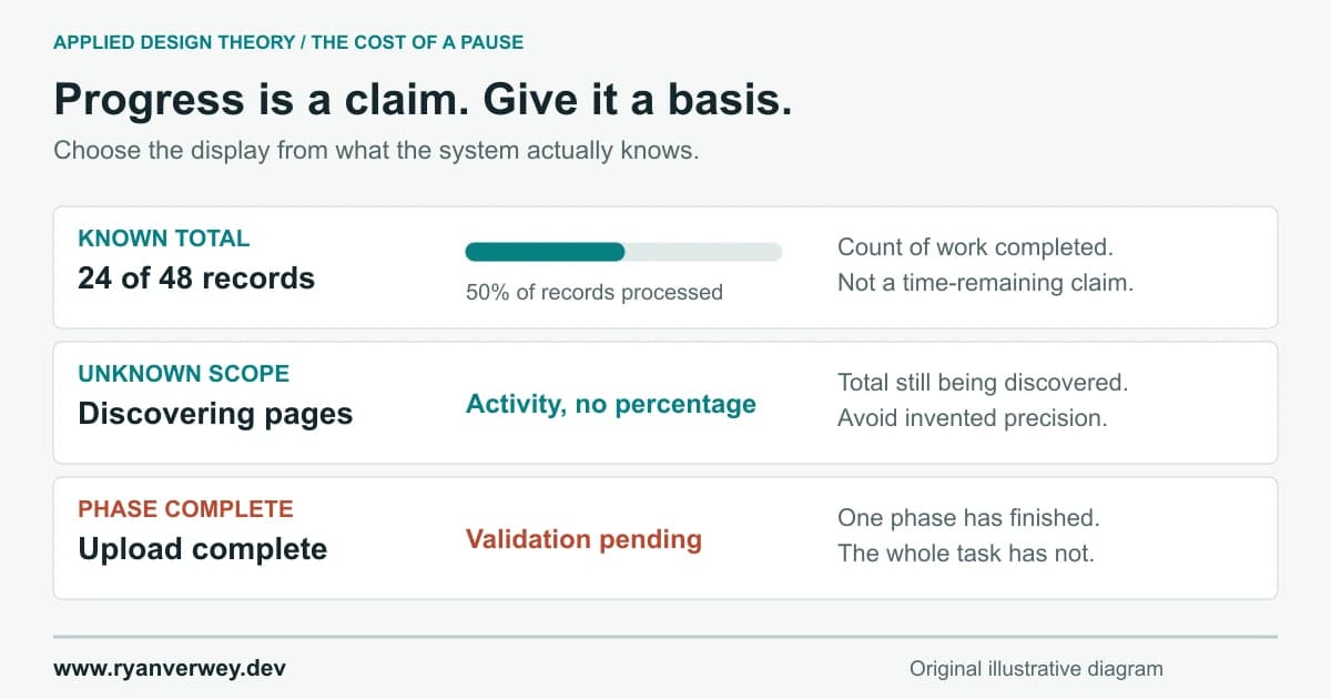
Illustrative interface states. The numbers demonstrate known units, not elapsed-time predictions or measured product performance.
Myers (1985) investigated percent-done indicators and found a preference for progress feedback in the study. The paper also discusses estimation and situations where total work cannot readily be calculated. It supports taking progress information seriously; it does not establish that every inaccurate indicator is harmless.
For our example, 24 of 48 records processed is meaningful. It does not necessarily mean half the elapsed time remains. One record might require substantially more work than another, and packaging the file might be a separate phase.
Label what the number measures. If the total grows during discovery, use a discovered-item count or a phase label instead of pretending the original denominator was final. When a phase finishes, identify what remains before the overall task is complete.
The crucial distinction is between an estimate that represents uncertain work and a number that has no relationship to the work at all.
Animation Should Explain a Change
Animation can connect an action to its result: an expanded row reveals its relationship to the item above it; a brief transition shows that a filter changed the visible collection. That is different from adding motion simply to occupy someone during a wait.
For the reporting tool, I would use a stable status area and restrained transitions between real states. I would avoid repeatedly rearranging the result list while the person is trying to inspect it. An attractive animation can still make the task harder if it moves the target they were about to select.
Loading transitions also have their own performance cost. If rendering a complex animation delays the controls it is supposed to reassure people about, the implementation has undermined the design intent. The appropriate question is whether the animation helps explain state while preserving responsiveness.
Account for reduced-motion preferences, and keep essential information in text or other perceivable state. A spinning shape cannot be the only evidence that a request is pending. If the work finishes almost immediately, showing the completed result may be clearer than flashing through several loading screens.
I would not hold a ready result behind an animation just to let that animation complete. Preserve the explanation where useful; release the result when it is available.
A Quick Interface Can Still Be Wrong
Optimistic updates are tempting because they let a user see a proposed change before server confirmation. That can be reasonable for some reversible actions, provided the interface can reconcile failure and conflicting updates.
Consider starring a report. An immediate visual change may be acceptable if rejection can be explained and the previous state restored. Now consider sending that report to a client. "Sent" before confirmation makes a much stronger promise and may cause the person to stop checking.
I would review the consequence, reversibility, and recovery path before choosing optimism. Speed alone is not the acceptance criterion.
Search introduces another problem: response ordering. A person types "annual," then replaces it with "monthly." If the annual request returns last and overwrites the monthly results, a fast screen has produced the wrong answer to the current question.
Associate responses with the request that still represents the user's intent. Cancel obsolete client work where appropriate, and guard against applying stale results. Canceling a browser request is not proof that server work or a consequential mutation was canceled.
That is where perceived performance becomes an engineering responsibility. The interface must remain coherent as requests complete in an order the designer did not draw.
When the Right Response Is a Background Job
Some tasks should not require continuous attention. A large export or site-wide audit can outlast a comfortable foreground interaction even when the system is functioning normally.
In that case, my preferred design is a reliable handoff. Confirm acceptance, provide an identifiable job, explain where its status lives, and let the person continue. If notifications are offered, make their destination and behavior clear rather than assuming permission to send them.
The interface must also be truthful about leaving the page. "You can close this tab" is appropriate only when the job persists independently and the result can be recovered later. A browser-only operation cannot make that promise simply because its progress display looks like a server job.
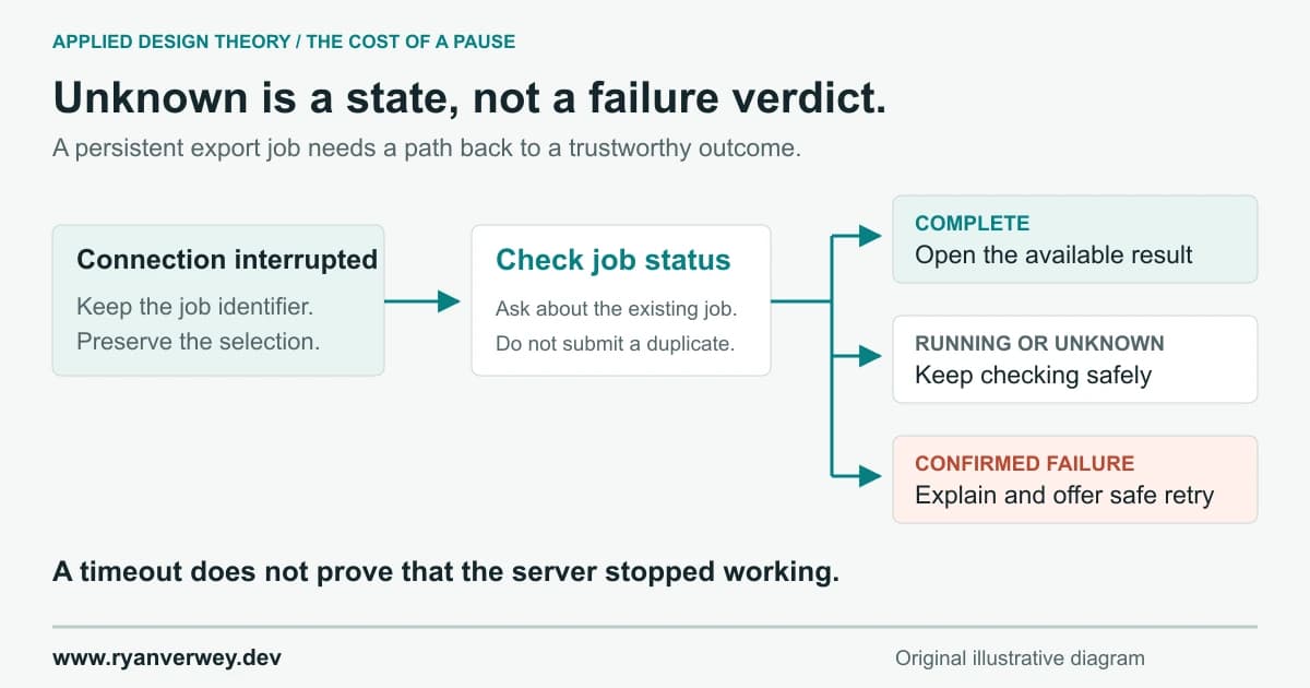
A proposed recovery flow for a persistent server job. Unknown status remains distinct from confirmed failure.
Returning should restore the task's meaning: what was requested, what state it is in, and what action is available now. That connects response design to The Shape of Understanding. A job history becomes useful when its information is grouped around a person's next decision.
A background process is not permission to forget the user. It changes the feedback relationship from continuous observation to dependable return.
Should We Ever Make People Wait on Purpose?
Buell and Norton (2011) studied operational transparency in simulated online travel and dating services. Across their experiments, showing apparent effort could increase perceived service value, and some conditions favored a wait with visible effort over an immediate result. Those findings concern particular experiences and judgments, not a general rule that slower software earns trust.
My design choice is to explain genuine work without inventing a delay to perform it theatrically. An audit can show the pages examined, the checks run, and the limits of its findings after the result is ready. A search can explain its filters and coverage without pretending to consult sources it never accessed.
This still leaves room for deliberate pacing that serves the person. A review step before publishing gives someone time to inspect consequences. An undo window provides a real opportunity to reverse an action. Neither needs to masquerade as computation.
The distinction I care about is whether the interval has a user-serving function. "We need confirmation before sending this to clients" is a defensible interaction requirement. "The result looks more impressive if we hide it for three seconds" deserves a much harder conversation.
This is also a place to apply The Confidence Trap. A polished display may increase confidence without improving the underlying result. We should test whether people understand what the system actually did, not merely whether they say it feels sophisticated.
Feedback Must Reach the Person Using It
A status label can be visible and still fail to reach someone using assistive technology. WCAG's guidance on status messages addresses updates that convey results, progress, waiting states, or errors without taking focus. Such messages need programmatic semantics so assistive technology can present them (World Wide Web Consortium, n.d.).
In practice, I would give a concise status update an appropriate live region, keep ordinary progress updates polite, and test the actual behavior with a screen reader. I would not announce every processed record if that creates a continuous stream of interruptions.
Keep keyboard focus predictable. Starting an export should not unexpectedly move focus to a decorative spinner. If the relevant control changes or disappears, decide where the user should continue and verify that behavior. Keep labels meaningful as state changes.
Motion, color, and a tiny toast are each insufficient as the sole communication channel. A user who returns after an interruption also needs a way to inspect status without having witnessed the original transition.
Fast visual feedback is only one part of responsiveness. The operational information has to remain available to the people who need it.
Measure the Interaction and the Outcome Separately
Interaction to Next Paint, or INP, measures browser interaction responsiveness through the next paint. Google's guidance classifies 200 milliseconds or less as good, assessed at the 75th percentile of page visits. It does not measure the full duration of an asynchronous export or prove that its contents are correct (Wagner & Pollard, 2025).
For our reporting tool, I would therefore collect separate evidence: whether the interface responds promptly, how long a request takes to be accepted, when a usable file becomes available, and whether the person successfully completes the intended task.
The timing definitions need to be explicit. Does "export complete" mean a worker finished writing bytes, the file is accessible, or the browser downloaded it? Those are different events. A dashboard that combines them under one label can conceal the exact delay people experience.
Look at distributions and failure cases as well as averages. Separate cold requests, large selections, and representative mobile conditions where possible. A reassuring median can coexist with a painful group of users who repeatedly encounter the slow path.
Then observe behavior: repeated clicks, abandoned requests, accidental duplicate jobs, and time spent checking elsewhere. These are investigation signals, not automatic proof of a particular cause. Pair them with task observation and users' explanations.
This follows the discipline of The Decision Tax: decide what outcome matters before choosing the number that will stand in for success.
Review the Uncomfortable States Before Shipping
Here is the walkthrough I would use with the hypothetical export flow. Each check has a consequence worth inspecting, rather than merely a component to tick off.
- Complete the fast path. Does a quick success appear cleanly, without an artificial wait or a confusing flash of multiple loading states?
- Slow down acceptance. Does the interface acknowledge the attempt while avoiding the unsupported claim that the job is already queued?
- Delay completion. Can the person tell what is pending, continue appropriate work, and find the result later?
- Change the selection mid-request. Does the completed export still identify the original scope, while the current selection remains accurate?
- Interrupt the connection after submission. Does the product check an existing operation before suggesting a potentially duplicate action?
- Return after leaving. Can the person identify the job, understand its current state, and take the correct next step?
- Use keyboard, screen reader, and reduced motion. Is the same essential status available without relying on a particular visual effect?
If the system does not yet support a check, that is a useful finding. A missing job-status endpoint cannot be repaired by more confident copy. A lack of idempotency cannot be solved solely by disabling a button in one browser tab.
This is why I want response design discussed before the final loading animation is chosen. It exposes requirements that belong in the service and data model as much as in the frontend.
Final Takeaway
The next time someone says an application feels slow, follow one action all the way through. Watch the first acknowledgment, the evidence of progress, the confirmation, and the route back from uncertainty.
You may find expensive processing. You may also find a button that appears unchanged, a success label that arrives too early, or a completed result trapped behind a presentation delay. These require different fixes.
The Doherty Threshold gives us a reason to take small pauses seriously. The broader design responsibility is to make the response truthful, useful, and recoverable.
Do the work quickly. Show what you know. Let people continue with confidence they can verify.
References
Buell, R. W., & Norton, M. I. (2011). The labor illusion: How operational transparency increases perceived value. Management Science, 57(9), 1564-1579. https://doi.org/10.1287/mnsc.1110.1376
Doherty, W. J., & Thadhani, A. J. (1982). The economic value of rapid response time. IBM. Reproduced on Jim Elliott's Mainframe Blog.
Myers, B. A. (1985). The importance of percent-done progress indicators for computer-human interfaces. In Proceedings of the SIGCHI Conference on Human Factors in Computing Systems (pp. 11-17). Association for Computing Machinery. Author-hosted paper.
Nielsen, J. (1993, January 1). Response times: The 3 important limits. Nielsen Norman Group. https://www.nngroup.com/articles/response-times-3-important-limits/
Wagner, J., & Pollard, B. (2025, September 2). Interaction to Next Paint (INP). web.dev. https://web.dev/articles/inp
World Wide Web Consortium. (n.d.). Understanding Success Criterion 4.1.3: Status messages.
Yablonski, J. (n.d.). Doherty Threshold. Laws of UX. https://lawsofux.com/doherty-threshold/
Frequently Asked Questions
Does every operation need to finish within 400 milliseconds?
No. The Doherty Threshold is useful guidance for examining the rhythm of interaction, not a universal completion deadline. Give prompt, meaningful feedback and design longer work with honest status, usable outcomes, and recovery.
Does showing a spinner satisfy the Doherty Threshold?
A spinner may acknowledge activity, but it does not establish progress or completion. It also does not reproduce the complete-response conditions discussed in the historical research. Judge feedback by what it lets the user understand and do.
Is a progress bar useful if its estimate is imperfect?
It can be, when it represents real work and communicates its basis honestly. Processing half the records does not necessarily mean half the time remains. If a total is unknown, use an appropriate phase or activity indicator instead of inventing a percentage.
Should I add a delay to make a result look more valuable?
I would explain the genuine work and make ready results available promptly. Research on operational transparency concerns specific conditions; it is not a general recommendation to delay users. Review steps and undo windows should serve clear user needs.
Is good INP the same as a fast completed task?
No. INP concerns interaction responsiveness through the next paint. A task can have prompt initial feedback and a slow or failed asynchronous outcome. Measure both, with clear definitions for success.
What is the Response Contract?
It is an original design-review heuristic used in this article: acknowledge the action, advance with evidence, confirm the outcome, and recover from uncertainty. It helps teams specify behavior; it is not a scientific score or an accessibility certification.
Share this article

Ryan VerWey
Full-stack developer, Army veteran, and founder of Echo Effect LLC. His experience timeline documents current Ratespedia CTO work, Department of War contractor work, and prior Army service. More about Ryan or see the work.
Recommended Reading
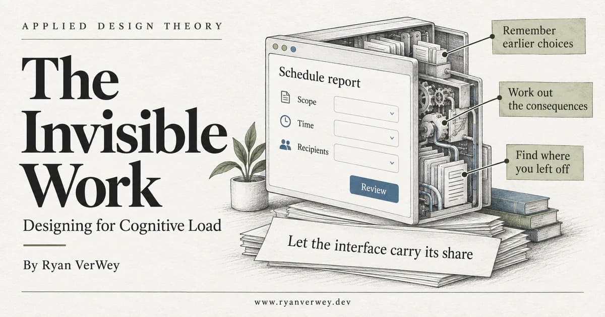
The Invisible Work: Designing for Cognitive Load
A developer's guide to cognitive load: expose hidden mental work, preserve task context, and build interfaces that support understanding without hiding decisions.
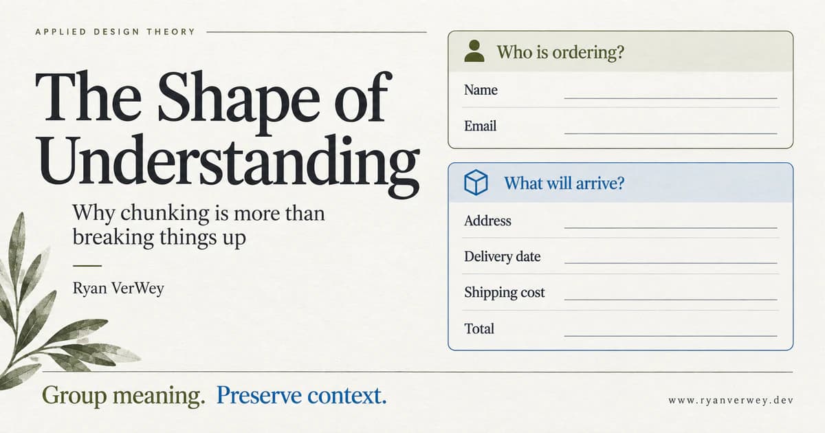
The Shape of Understanding: Why Chunking Is More Than Breaking Things Up
Chunking is more than dividing content into cards. Learn to group meaning, preserve context, and test whether your interface helps people understand.
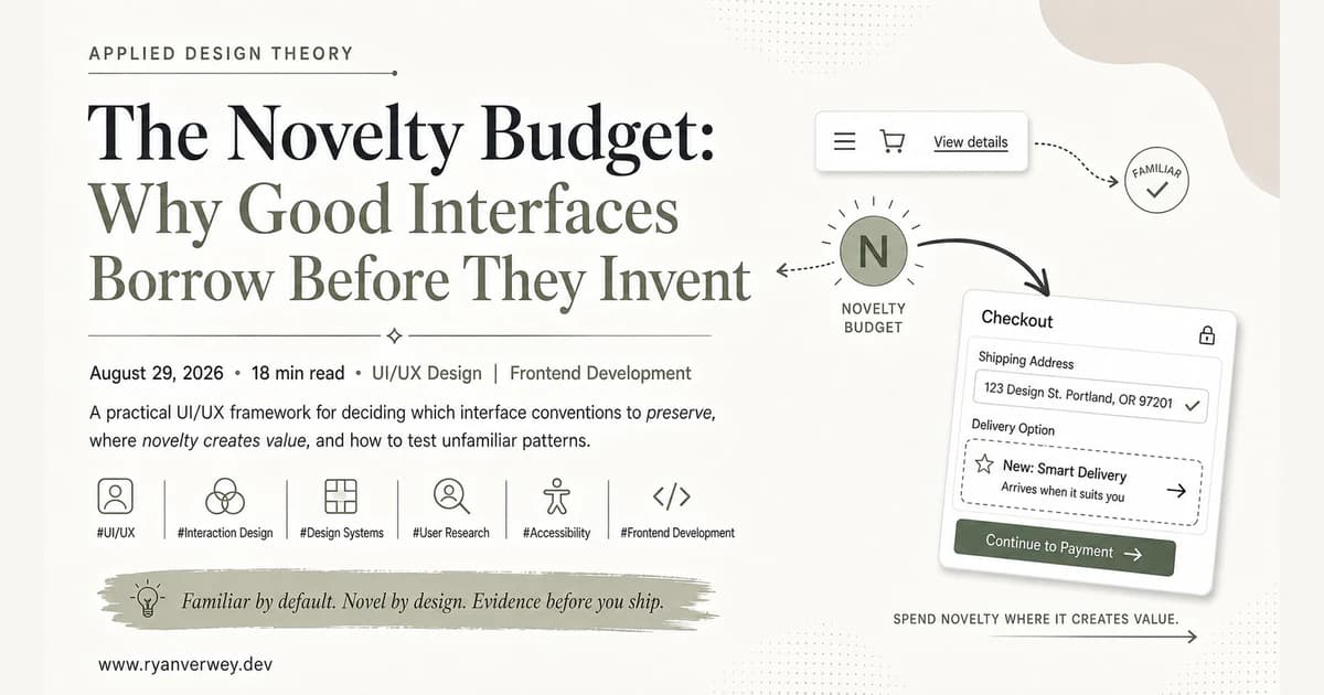
The Novelty Budget: Why Good Interfaces Borrow Before They Invent
A practical UI/UX framework for deciding which interface conventions to preserve, where novelty creates value, and how to test unfamiliar patterns.