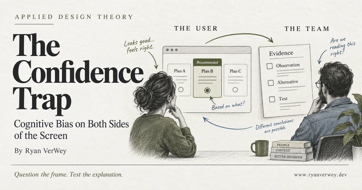
The Confidence Trap: Cognitive Bias on Both Sides of the Screen
Cognitive bias shapes users and the teams building for them. Learn to question interface framing, test assumptions, and separate confidence from evidence.
Cognitive bias is a systematic tendency in judgment that can pull an interpretation away from the evidence. In interface design, it matters twice: when someone makes a choice using our product, and when we decide what their behavior means.
Imagine adding a recommendation badge to a pricing page. More visitors choose the highlighted plan. The team celebrates a clearer interface.
Maybe that is what happened. Maybe the badge simply drew attention. Maybe visitors misunderstood the billing interval. Maybe a different campaign brought in a different audience that week.
The event is real. The explanation is still unfinished.
That gap is the subject of this fourth article in Applied Design Theory. I am less interested in memorizing a hundred bias names than in the moment a plausible story becomes an unquestioned product decision. As a developer, I want something I can use in a design review, a pull request, or a conversation about whether a feature is actually helping.
A more convincing interface is not necessarily a more understandable one. A more confident team is not necessarily a better-informed one.
A Shortcut Is Not Automatically a Mistake
A heuristic is a practical shortcut for making a judgment. A bias is a systematic pattern of error, not simply another word for speed, emotion, or a preference the designer dislikes.
Tversky and Kahneman (1974) examined how people estimate uncertain outcomes using heuristics such as availability, representativeness, and anchoring. Their work showed how useful simplifying strategies can also produce predictable errors. The important distinction is between the strategy and the circumstances in which it misleads. Read the original paper.
Recognizing a familiar navigation pattern is not a defect in reasoning. Neither is choosing the tool your team already knows when migration would be expensive. A supposedly inferior choice can make sense once time, risk, constraints, and personal priorities are considered.
For that reason, I would not call a user biased because they ignored the option I wanted them to choose. First, I need to understand their goal. Then I need to understand what they believed the options would do.
The design problem begins when the interface encourages an inference it cannot support: that a prominently displayed plan is suitable for everyone, that a polished score is a complete assessment, or that leaving a setting unchanged means someone deliberately agreed with it.
My responsibility is not to eliminate shortcuts. It is to make the shortcuts the product invites reasonably trustworthy.
The Two Sides of the Screen
I find it useful to separate two questions during a review.
On the visitor's side: what conclusion does this presentation invite? A price, badge, default, testimonial, or warning does more than occupy space. It helps establish what looks normal, urgent, credible, or worth comparing.
On the team's side: what conclusion are we drawing from the response? A click, completion, complaint, or interview quote is evidence of something. It is not automatically evidence of the thing we hoped to prove.
These questions belong together because a team can create a persuasive presentation, observe the behavior it encouraged, and then treat that behavior as independent confirmation that its original idea was correct.
Consider a hypothetical report tool. The product describes one issue as urgent, places it first, and gives it the strongest color. Customers open that issue most often. Calling it their highest priority skips over the role the interface played in directing attention.
It may genuinely deserve first place. But that judgment needs evidence about consequences and user goals, not just evidence that people followed the hierarchy we built.
This is the confidence trap: we design the conditions of a decision, then forget those conditions when interpreting the result.
The Number Can Stay the Same While the Story Changes
Framing concerns how a decision is presented. Tversky and Kahneman (1981) demonstrated shifts in preference when equivalent decision problems were expressed differently. That finding supports examining presentation; it does not tell us that every positive phrase will outperform every negative one in every product. Read the study.
There is a particularly relevant example for our own profession. Whitenton (2017) reported an online investigation involving more than 1,000 UX practitioners who received differently framed versions of a hypothetical search-usability result. Support for redesign was 51% with failure wording and 39% with success wording. This was a difference in practitioners' judgments about a scenario, not a measured improvement in a live website. Read the investigation and its context.
Here is a separate, invented example for our review table. In one onboarding test, 40 of 50 invited participants create a first project. Saying that 80% completed and saying that 20% did not are both accurate. Neither tells us whether to launch.
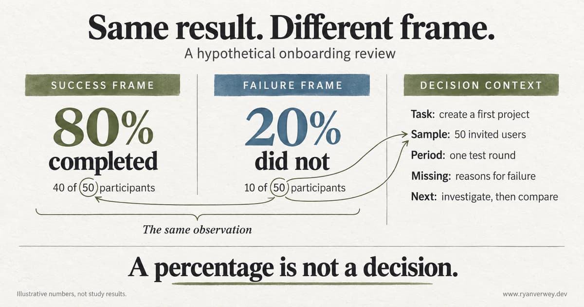
These numbers are illustrative, not research results. The graphic demonstrates equivalent descriptions and the context still needed to interpret them.
I would want to know who participated, where the failures happened, whether assistance counted as completion, and what the task represented. Failing to create a disposable demo project and failing to submit a time-sensitive application are not interchangeable outcomes.
My practical rule for a report is to keep the underlying count, population, period, and definition available next to the headline. Where useful, show both completed and incomplete outcomes. This will not make a decision neutral, but it makes a one-sided summary easier to question.
The same discipline belongs in product copy. A monthly equivalent should not conceal an annual charge. A percentage improvement should identify its baseline. A recommendation should explain its criteria. Readers should not have to reverse-engineer the comparison.
Confirmation Bias Can Look Like Thorough Research
Nickerson (1998) describes confirmation bias as favoring existing beliefs in the search for or interpretation of evidence. His review covers more than simply refusing to listen: the questions asked and the weight assigned to information can also favor an expected conclusion. Read Nickerson's review.
For product work, my concern is research that begins with a verdict and ends with supporting material.
Suppose I want to replace a settings page with a conversational assistant. I could gather enthusiastic comments about AI, demonstrate the easiest task, and ask whether the new interaction feels modern. Every step produces material, but none directly tests whether the assistant is a better way to manage settings.
A more useful question would be: can people make and verify the intended change without introducing another one? That question leaves room for the existing page to perform better. It also allows the assistant to succeed for some tasks and fail for others.
Before building a prototype, I would write down the proposed advantage and a credible reason it might not appear. For the assistant, a plausible failure is that conversational convenience makes the final configuration harder to inspect.
That changes the prototype. It now needs a visible summary, a clear commit step, and a way to review what changed. The competing explanation has produced a better engineering question before a study has even begun.
The objective is not to manufacture disagreement. It is to make the preferred explanation answerable to something other than our enthusiasm.
Record the Behavior Before Telling Its Story
For ambiguous findings, I use a small evidence ledger: observation, first explanation, alternatives, and next test. It is a working documentation pattern, not a diagnostic instrument.
Return to the hypothetical pricing page. The observation is that more visitors selected the highlighted plan. The interpretation is that the recommendation helped them choose. Those belong on different lines.
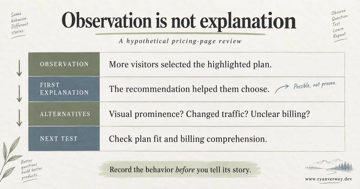
An original worked example. The ledger preserves uncertainty rather than assigning a psychological cause to a click.
The next test should distinguish explanations, not merely collect more of the same signal. If the claim is better plan selection, ask whether the chosen plan supports the person's stated requirements. If the claim is clearer pricing, ask them to explain what they expect to pay and when.
Even an experiment showing that the badge caused more selections would not, by itself, establish why it worked or whether customers benefited. A causal effect on a click is narrower than a causal explanation of understanding.
I also want the ledger to retain contrary observations. Someone choosing the highlighted plan and then immediately switching away is not an inconvenient detail to remove from a success story. It may help explain the story.
There is an engineering benefit here: a future maintainer can see which decisions were supported, which were provisional, and what evidence would justify revisiting them.
An Anchor Is Not the Same as a Useful Reference
Anchoring describes judgments being pulled toward an initial reference, with adjustment that can be insufficient. Availability concerns judgments influenced by how readily examples come to mind. Both appear in Tversky and Kahneman's (1974) discussion of judgment under uncertainty.
I would not turn either concept into an automatic prescription to remove references or ignore memorable incidents.
A pricing comparison needs reference points. The question is whether the reference helps someone assess their actual decision. Showing a legitimate annual total beside a monthly equivalent can clarify a commitment. Displaying an unrelated high price only to make another number feel small does not provide the same service.
Likewise, a vivid support complaint can reveal a serious problem before it appears frequently in a dashboard. One report of a destructive workflow may deserve immediate investigation. Its seriousness and its prevalence are separate questions.
For a roadmap discussion, I would record both: how many people we know are affected, and how consequential the failure is. I would also record what we do not know. A small count can reflect a rare problem, weak reporting, or a problem that prevents people from reaching support.
The goal is not to replace a striking story with a reassuring average. It is to stop either from pretending to be the whole picture.
The People Missing From the Data Matter
Not every misleading conclusion is best understood as a cognitive bias. A sample that excludes important users is also a research-design problem. Broken event tracking is an instrumentation problem. Missing authorization feedback may be a product defect.
Calling all of these things bias can make a discussion sound sophisticated while obscuring what needs fixing.
Imagine evaluating onboarding only through a survey shown after successful setup. The survey can describe the experience of respondents who got that far. It cannot, on its own, explain why other people never finished.
For a review of that flow, I would map the evidence to the journey: who saw the entry point, who started, who reached each state, who stopped, and who was invited to provide feedback. The exact measurement method depends on consent, privacy, and the product, but the scope of each claim should remain explicit.
This also matters when an interface works well for the people in the room. A mouse-based walkthrough does not establish that the workflow is usable from a keyboard. A desktop screenshot does not establish that its explanation survives on a narrow screen.
Those are observable questions. Test them directly instead of interpreting absent complaints as proof of inclusion.
Awareness Needs Something to Hold It in Place
There is a tempting conclusion after learning about bias: now that I can recognize it, I will make better decisions. I would rather turn that intention into a repeatable practice than rely on remembering it at the right moment.
That is not an argument that improvement is impossible. Morewedge et al. (2015) reported two experiments in which a video or interactive game reduced selected decision biases, with effects assessed immediately and at follow-up eight or twelve weeks later. The interventions included instruction and strategies, with practice and personalized feedback in the games. The findings concern particular measures and training conditions, not permanent protection against every biased decision. Read the study.
The implication I draw for product work is modest: make room to practice better reasoning and get feedback on it. Do not treat a vocabulary lesson as a completed safeguard.
For a consequential release, I would capture expectations before looking at the result. Ask reviewers to write their initial assessment before a group discussion. Assign someone to investigate a credible alternative, not to oppose the project for sport. Schedule a review after enough evidence can reasonably accumulate.
These are process choices, not guarantees. They create a record that is harder to quietly rewrite when a favorite feature underperforms.
The Counterweight Review
Here is my practical framework for this article: the Counterweight Review. It is an original design-review heuristic, not a validated psychological assessment or a score of how biased a team is.
The idea is to pair each confident claim with something that could qualify it, challenge it, or tell us when to reconsider.
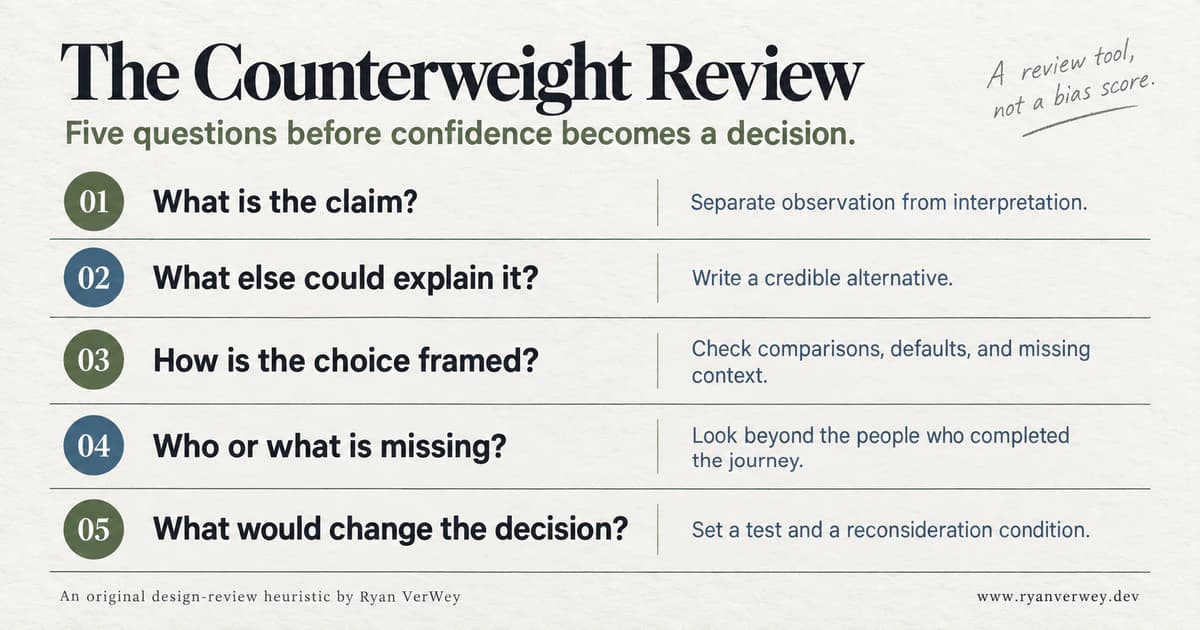
Five questions for a review document. The purpose is an inspectable decision, not a numerical bias rating.
1. What Is the Claim?
Write a sentence precise enough to investigate. "The new pricing page is better" is a preference disguised as a finding. "People can identify the least expensive plan that meets their requirements" describes a task.
For our hypothetical recommendation badge, I would distinguish the business objective, increased adoption, from the user objective, selecting an appropriate plan. They can align, but I do not want to assume that alignment in the measurement.
2. What Else Could Explain It?
Name at least one plausible alternative before declaring success. Changed traffic, visual prominence, clearer copy, and mistaken assumptions about price are different explanations with different implications.
Choose alternatives that could change what you build. A list of remote possibilities is not useful if nobody can investigate it. Here, checking expected billing and actual requirements could reveal whether increased selection reflects understanding or confusion.
3. How Is the Choice Framed?
Inspect comparisons, defaults, labels, order, and omitted context. What is being made easy to notice? What must someone open another page to discover?
For the badge, ask what "Recommended" means. If it is based on a stated team size and required features, show that basis. If there is no individual fit assessment, do not present the label as though one occurred. A general description such as "Includes team permissions" may be more defensible.
4. Who or What Is Missing?
Identify the limits of the evidence. Are we hearing only from paid customers, successful completers, or people willing to answer a survey? Did the test exclude a device or interaction method central to real use?
For the pricing example, include people who decided that none of the plans fit. Choosing not to buy can be a successful decision for the visitor. It should not automatically be classified as a design failure.
5. What Would Change the Decision?
Specify a test and a condition for reconsideration. If more people select a plan but cannot explain the annual commitment, I would not call the result a usability improvement.
Record who owns the follow-up and what evidence is still needed. A decision can be provisional without being directionless. "Ship to a limited audience while checking comprehension and cancellation reasons" is different from "Ship, then look for good numbers."
Turn the Review Into an Implementation Contract
The most useful outcome of a design discussion is often a small change to what the software must represent.
For the hypothetical pricing page, I would want the data model to distinguish a charge amount from its display equivalent. The UI should not reconstruct an annual commitment from a marketing string. A recommendation should have an explicit basis that can be displayed, tested, and changed without rewriting unrelated content.
That produces concrete acceptance criteria:
- The billing interval and amount charged appear together before confirmation.
- A recommendation includes a truthful explanation of its basis.
- Comparable features use consistent names and units across plans.
- Selecting another plan does not require dismissing a discouraging or misleading message.
- The final confirmation identifies the selected plan and commitment.
- The same decision-critical information remains available on mobile and through keyboard navigation.
This is not a request to turn every screen into a disclaimer. It is a request to keep the facts that justify a choice connected to the choice itself.
Testing can then cover more than rendering. Does switching billing modes update both the price and the commitment? Does the recommendation explanation match the eligibility rule? Can a person review a selection before it becomes an action?
Psychology has become useful here because it led to better requirements, not because a bias name was attached to a component.
AI Summaries Need the Same Scrutiny
A generated summary can compress research notes into a fluent explanation. I would still treat that explanation as an interpretation requiring inspection.
Suppose a summary says, "Users prefer the simplified dashboard." I would ask which observations support that sentence, which participants it refers to, what simplified means, and whether conflicting evidence was preserved. A polished paragraph should not get a lower burden of proof than a colleague's opinion.
For an AI-assisted research workflow, I would separate source excerpts, synthesis, and proposed action. Each should be identifiable. A recommendation should link back to the relevant evidence, while uncertainty and missing context remain visible.
I would also avoid asking only for reasons a proposed redesign will work. Ask what the available evidence cannot establish. Then check the answer against the underlying material. A generated alternative is a prompt for investigation, not additional user research.
The principle is the same whether the confident sentence came from a model, a dashboard, or me: show the route from observation to conclusion.
Measure the Decision, Not Just the Movement
For the pricing example, I would look at three kinds of evidence together: whether people completed the task, whether they understood the commitment, and what happened afterward.
Completion might include selecting an appropriate plan or correctly deciding that none fits. Understanding might be assessed by asking someone to explain the cost and expected capabilities in their own words. Follow-up might include avoidable plan changes, billing confusion, or support requests, interpreted with their own limitations.
None of those measures is perfect. Together they make a narrower success story harder to confuse with a complete one.
Choose the outcome definitions before inspecting the results. When traffic is too limited for a meaningful experiment, do not manufacture certainty from a noisy before-and-after chart. Use task-based observation to investigate misunderstandings and describe what the evidence does and does not support.
A useful review can end with "We found a comprehension problem and have a specific change to test." It does not need to end with a percentage improvement.
How This Connects to the Series
In The Novelty Budget, I argued for spending unfamiliarity where it creates a real benefit. Cognitive bias adds a check on how we decide that benefit exists.
In The Decision Tax, the focus was helping people narrow and compare options. Here, the additional question is whether the narrowing serves their goals or merely our preferred outcome.
In The Shape of Understanding, grouping information was a responsibility to preserve meaning. Framing asks whether that meaning remains honest when we choose the headline, the comparison, and the details that stay visible.
These are not separate tricks. They are related ways of examining the relationship between a presentation and the decision it supports.
Final Takeaway
Understanding cognitive bias should make a design conversation more curious, not more accusatory. "You are biased" rarely tells a team what to build next. "What else could explain this result?" can.
I want interfaces that let people understand the basis of a recommendation, compare relevant facts, and change their minds. I want the same qualities in the process used to create those interfaces.
We will still need judgment. We will still work with incomplete information. The improvement is not perfect objectivity; it is a decision whose assumptions are visible enough to challenge.
Confidence should follow the evidence, and the evidence should remain open to inspection.
References
Morewedge, C. K., Yoon, H., Scopelliti, I., Symborski, C. W., Korris, J. H., & Kassam, K. S. (2015). Debiasing decisions: Improved decision making with a single training intervention. Policy Insights from the Behavioral and Brain Sciences, 2(1), 129-140. https://doi.org/10.1177/2372732215600886
Nickerson, R. S. (1998). Confirmation bias: A ubiquitous phenomenon in many guises. Review of General Psychology, 2(2), 175-220. https://doi.org/10.1037/1089-2680.2.2.175
Tversky, A., & Kahneman, D. (1974). Judgment under uncertainty: Heuristics and biases. Science, 185(4157), 1124-1131. https://doi.org/10.1126/science.185.4157.1124
Tversky, A., & Kahneman, D. (1981). The framing of decisions and the psychology of choice. Science, 211(4481), 453-458. https://doi.org/10.1126/science.7455683
Whitenton, K. (2017, December 19). Decision frames: How cognitive biases affect UX practitioners. Nielsen Norman Group. https://www.nngroup.com/articles/decision-framing-cognitive-bias-ux-pros/
Frequently Asked Questions
What Is Cognitive Bias in UI/UX Design?
Cognitive bias concerns systematic tendencies in judgment. In UI/UX work, the relevant questions include how an interface presents a decision and how a team interprets the behavior that follows. A click alone does not establish a psychological cause.
Is Every Mental Shortcut a Cognitive Bias?
No. A heuristic is a simplifying strategy; bias describes a systematic error. Familiar patterns and useful reference points can support good decisions. Whether a shortcut misleads depends on the task, information, and context.
How Can a Team Reduce Confirmation Bias?
Separate observations from interpretations, write credible competing explanations, and decide what evidence would change the proposal before judging the result. These practices make assumptions testable; they do not guarantee immunity to bias.
Should Designers Stop Using Defaults and Recommendations?
No. Review whether they support a person's goals, explain their basis honestly, keep alternatives understandable, and allow changes. A recommendation should not imply an individualized assessment that the product has not performed.
What Is the Counterweight Review?
It is the original five-question review heuristic introduced in this article: identify the claim, consider alternatives, inspect the frame, identify missing evidence, and specify what would change the decision. It is not a validated bias scale.
Share this article

Ryan VerWey
Full-stack developer, Army veteran, and founder of Echo Effect LLC. His experience timeline documents current Ratespedia CTO work, Department of War contractor work, and prior Army service. More about Ryan or see the work.
Recommended Reading
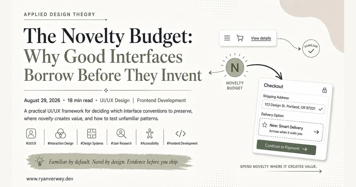
The Novelty Budget: Why Good Interfaces Borrow Before They Invent
A practical UI/UX framework for deciding which interface conventions to preserve, where novelty creates value, and how to test unfamiliar patterns.
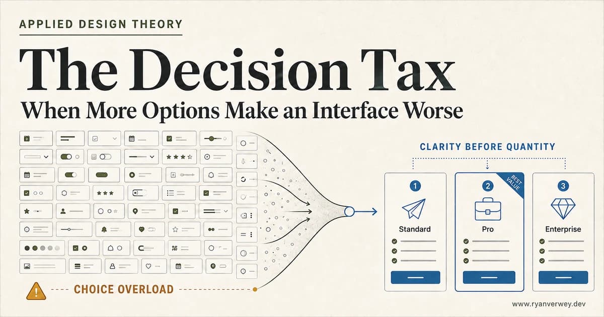
The Decision Tax: When More Options Make an Interface Worse
Choice overload is not a magic number. Learn how to structure options, comparisons, defaults, and filters so users can choose with confidence.
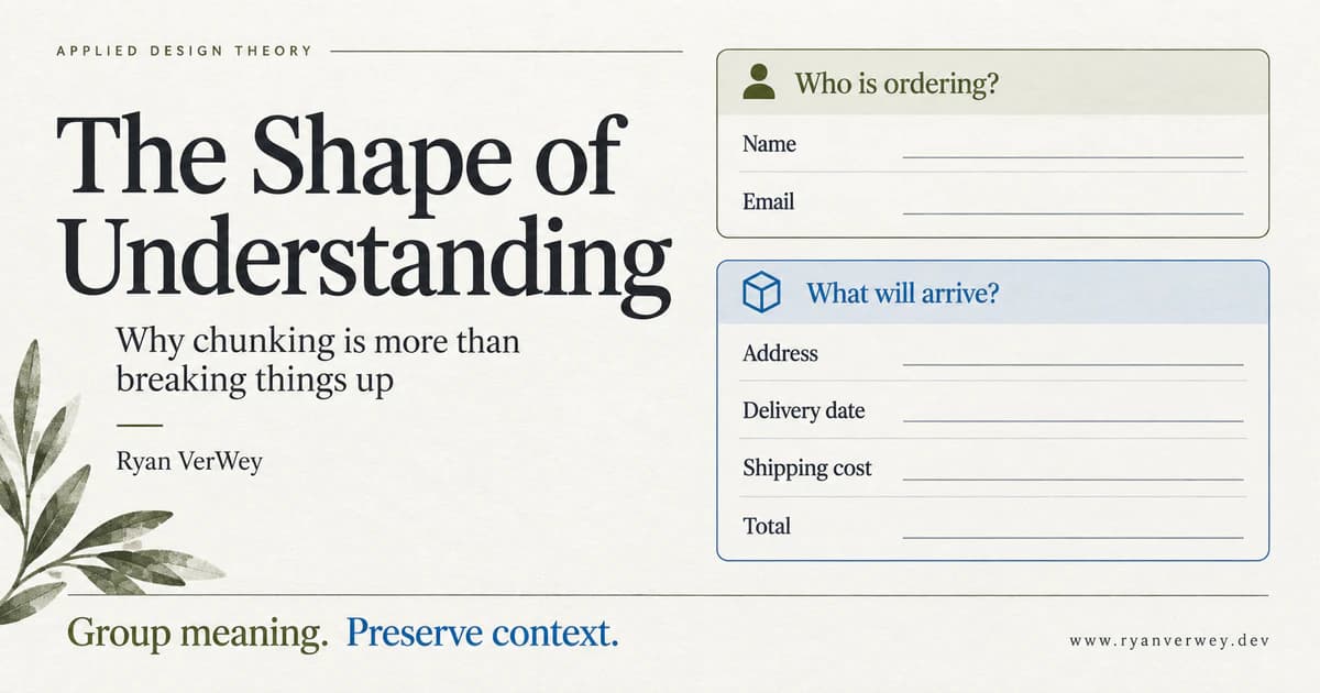
The Shape of Understanding: Why Chunking Is More Than Breaking Things Up
Chunking is more than dividing content into cards. Learn to group meaning, preserve context, and test whether your interface helps people understand.