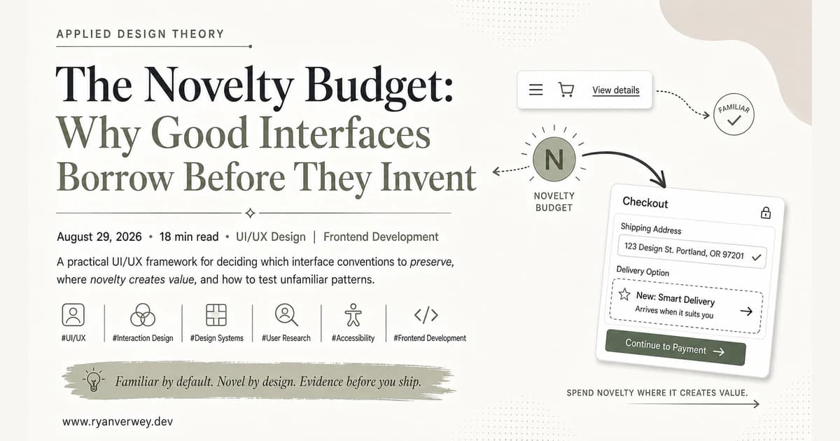
The Novelty Budget: Why Good Interfaces Borrow Before They Invent
A practical UI/UX framework for deciding which interface conventions to preserve, where novelty creates value, and how to test unfamiliar patterns.
Familiar interfaces are not successful because designers lack imagination. They are successful because users arrive with experience already installed. A cart icon, an underlined link, a Back action, a visible form label, and a predictable checkout sequence let people act before they have studied the product.
Novel interfaces are not automatically brave, innovative, or better. Every unfamiliar behavior asks the user to stop, inspect, predict, test, and remember. That learning can be worthwhile, but only when the product returns more value than the interaction costs to understand.
My working rule is simple: every interface has a novelty budget. Spend it on the part of the experience that makes the product meaningfully different. Borrow the rest from patterns people already know.
This first entry in my Applied Design Theory series explains how I decide what to preserve, what to challenge, and what evidence I want before an unfamiliar pattern ships.
Familiarity Is Stored Work
When a user recognizes a pattern, they are not beginning from zero. They are applying prior practice from other products, physical objects, and repeated tasks. The designer benefits from work that someone else already paid for.
That is the useful core of Jakob's Law: people spend most of their time using products other than ours, so their expectations are shaped elsewhere. Megan Chan's discussion of mental models describes those expectations as beliefs people use to predict what a system will do. The belief does not have to be technically accurate to guide behavior. If an interface looks like a search field, people expect it to search. If a logo sits in a site header, many people expect it to return them home. If Back looks available, they expect it to reverse the last navigational step.
This is why familiarity is more than a visual preference. It is stored work. It carries four practical advantages:
- Faster orientation. People can identify where they are and what they can do without reading instructions.
- Lower memory demand. Visible, recognizable options reduce the need to recall commands or hidden rules.
- More confident prediction. People can estimate what will happen before they act.
- Faster recovery. Familiar error messages, undo actions, and Back behavior help people recover when something goes wrong.
Raluca Budiu's explanation of recognition versus recall matters here. Recognition gives memory more cues. A visible list of options is easier to work with than a blank field that expects the user to remember a command. A labeled icon is usually easier to interpret than an icon whose meaning must be learned. A recent-history list is easier than reconstructing where you were from memory.
The strongest interfaces often feel obvious not because they are simple underneath, but because they preserve enough familiar cues that the underlying complexity does not become the user's first problem.
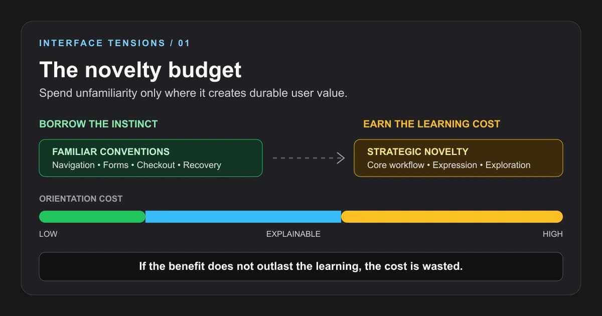
The novelty budget treats unfamiliarity as a real product cost. The cost is justified only when the benefit survives beyond the first moment of surprise.
Novelty Is a Cost Before It Becomes a Capability
Design teams experience a product differently from the people using it. We see the same screens for weeks or months. We know the vocabulary, the edge cases, the roadmap, and the logic behind every exception. Familiarity can make a working interface feel stale to the team long before it feels stale to the user.
That imbalance is dangerous. A redesign can solve the team's boredom while creating the user's confusion.
Nielsen Norman Group's article on the power law of learning makes the underlying tradeoff clear: a common pattern benefits from practice accumulated across many products, while a new pattern begins at the steep end of its learning curve. The new design may eventually become more efficient, but the user has to remain engaged long enough to reach that point.
This does not mean novelty is bad. It means novelty has an invoice.
An unfamiliar pattern may require:
- additional explanation or contextual guidance
- clearer system feedback after each action
- a fallback for users who do not discover the new behavior
- stronger error recovery because prediction is weaker
- accessibility testing across keyboard, touch, zoom, and assistive technology
- repeated exposure before the interaction becomes efficient
Those costs are reasonable when the new behavior unlocks something meaningful. They are wasteful when the change exists mainly to make a common task look distinctive.
Replacing a conventional checkout flow with a radial gesture menu is novelty attached to a high-risk commodity task. Giving a data analyst a new way to manipulate a complex relationship directly on a canvas may be novelty attached to the actual value of the product. Both interactions can look original. Only one has a credible reason to ask the user to learn.
The Difference Between Visual Novelty and Behavioral Novelty
One reason teams argue past each other is that "novel" can describe several different things.
Visual novelty changes how the experience feels. It can come from typography, illustration, color relationships, composition, rhythm, photography, or motion. A page can look unmistakably original while its links, forms, menus, and controls remain conventional.
Structural novelty changes where information lives or how the experience is organized. A product may replace a familiar top navigation with a persistent workspace rail, reorganize content around objects instead of pages, or introduce a new hierarchy.
Behavioral novelty changes what actions mean and how the user performs them. This is the most expensive form because it changes prediction. The same gesture may produce a different result, a familiar control may behave in an unfamiliar way, or a task may require a sequence the user has never practiced.
These forms should not be treated as equally risky. Visual expression can create a memorable brand without forcing the user to relearn basic operation. Structural change requires stronger orientation. Behavioral change needs the strongest justification, feedback, and testing.
That separation gives a team more room than the familiar-versus-novel debate usually suggests. We do not have to choose between a generic interface and an experimental one. We can keep the interaction contract familiar while making the experience visually specific to the product.
Three Layers of Interface Change
I use three layers to decide where invention belongs: safety, product, and expression.
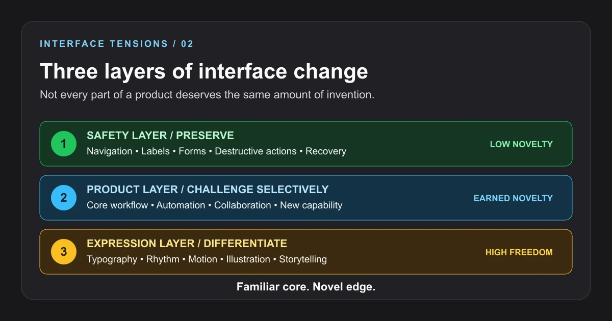
The safest approach is not uniform conservatism. It is assigning a different level of freedom to each layer of the experience.
1. The Safety Layer: Preserve the Contract
The safety layer includes the actions people rely on to move, understand consequences, submit information, and recover. It covers navigation, form labels, focus behavior, destructive actions, confirmation, undo, status, and error messages.
This layer should usually be boring in the best possible way. A destructive button should look and behave like a destructive action. A keyboard user should encounter controls in a meaningful order. A required field should be identified before submission. A Back action should not secretly jump to an unrelated hierarchy level.
Consistency here is also an accessibility concern. The W3C guidance for WCAG 2.2 Success Criterion 3.2.3 explains that repeated navigation in a consistent relative order helps people predict where functions will appear. That predictability is particularly important for users working through screen magnification, sequential screen-reader output, cognitive limitations, or limited motor input.
Novelty in the safety layer can make the product memorable for the wrong reason. If a person has to learn your unique meaning for Save, Close, Back, Delete, Search, or Submit, the interface is spending attention on infrastructure instead of value.
2. The Product Layer: Challenge Selectively
The product layer is where the application performs its defining work. This is the most defensible place for behavioral novelty because a better interaction can become a real capability.
An AI-assisted editor may need a new pattern for reviewing proposed changes before they are applied. A spatial planning tool may need direct manipulation that has no close equivalent in a document interface. A collaboration product may need a new way to show presence, ownership, or branching work. A complex audit product may need to turn hundreds of findings into a prioritized repair plan instead of another flat report.
This is where I am willing to challenge convention, but I still want familiar anchors around the new behavior. The user should recognize the objects, labels, state changes, and recovery options even if the core workflow is new.
While building Optimize, for example, the distinctive value was not inventing a strange new way to click through a report. The value was in turning SEO, AEO, GEO, crawler, structured-data, and accessibility findings into a clearer decision surface. Familiar report organization provided the foothold. The product logic supplied the difference.
The same principle shapes design-system work. In building an Angular design system, I found that consistency at the component and token level creates room for teams to solve higher-order product problems. If every button, form field, spacing decision, or responsive pattern is reinvented locally, the organization spends its novelty budget before it reaches anything customers value.
3. The Expression Layer: Differentiate Deliberately
The expression layer includes typography, imagery, pacing, transitions, tone, editorial composition, and moments of delight. This layer can carry far more novelty because it can create distinction without changing the meaning of basic actions.
A portfolio, cultural story, game, campaign, or product launch may benefit from visual surprise and exploration. An operational dashboard used throughout a workday usually needs more restraint. The right amount of expression depends on context, but expression is generally a safer place to be bold than navigation or error recovery.
The important distinction is that visual originality should support comprehension, not compete with it. Motion can show a relationship, reveal state, or guide attention. It can also delay access and make the user wait for the designer's performance to finish. Typography can establish a strong voice. It can also reduce readability. An unusual layout can create a memorable sequence. It can also hide the next action.
Novelty becomes useful when it clarifies the product's identity or content while leaving the interaction contract intact.
Familiarity Is Not the Same as Sameness
Following conventions does not require cloning competitors. A familiar pattern describes an expectation, not a finished appearance.
Consider a card. The convention is not a particular shadow, border radius, or color. The convention is that related information is grouped into a recognizable unit, often with a clear hierarchy and an action that belongs to that unit. A team can express that relationship through editorial spacing, a dense utility row, a bordered region, an image-led layout, or no visible container at all.
The same is true for navigation. Familiarity means users can identify where navigation is, understand the available destinations, perceive the current location, and operate it with the inputs they use. It does not require every site to share the same typography or visual composition.
This is where design systems are often misunderstood. A design system should not flatten every product into one visual template. It should stabilize the decisions that benefit from repetition so designers and developers can spend their attention on context. Tokens, accessible controls, interaction states, and semantic patterns create a dependable grammar. Products still decide what to say with it.
The goal is not sameness. The goal is transferable confidence.
When Novelty Earns Its Place
Novelty has the strongest case in four situations.
The Existing Pattern Cannot Express the Capability
Sometimes a product does something that familiar controls do not represent well. Forcing a new capability into an old metaphor can create more confusion than teaching a new pattern.
The test is whether the innovation changes the user's power, not merely the presentation. If a new interaction lets people see relationships, compare alternatives, automate a repeated task, or collaborate in a way the old pattern could not support, the learning cost may have a durable return.
Repetition Will Repay the Learning
An interaction used once must be immediately understandable. An interaction used dozens of times a day can justify a short learning curve if it becomes significantly faster or clearer with practice.
This is why expert tools can support shortcuts, direct manipulation, command palettes, and dense controls that would be inappropriate in a one-time consumer flow. The user has repeated opportunities to convert learning into fluency.
Frequency does not excuse a bad first experience. It changes the return calculation. The product still needs clear onboarding, visible feedback, and a path back to safety.
Exploration Is the Task
Some experiences are built to encourage discovery rather than rapid completion. Interactive storytelling, data exploration, creative tools, and games may use surprise as part of the value.
In those cases, a completely predictable sequence can work against the purpose. The interface should still communicate what is interactive, maintain keyboard and touch access, and protect the user from dead ends. Exploration is not a license to remove orientation.
The Pattern Creates Real Differentiation
A product may need a recognizable interaction of its own, especially when the workflow is central to its identity. The strongest signature interactions become shorthand for the product because they are useful first and distinctive second.
That order matters. If the only defense is "nobody else does it this way," the design has demonstrated difference, not value.
Where Familiarity Should Usually Win
Familiarity should dominate when the cost of error is high, the task is infrequent, the user is under pressure, or the interaction is only supporting infrastructure.
That includes:
- authentication and account recovery
- payments, checkout, and subscription changes
- consent and privacy decisions
- destructive operations
- navigation and wayfinding
- form completion and validation
- accessibility controls
- system status and error recovery
These are poor places to demand interpretation. A user who is trying to recover an account or understand a failed payment is not looking for a signature interaction. They need clarity, predictability, and a safe next step.
Familiarity should also win when novelty is being used to hide weak information architecture. A dramatic menu cannot repair unclear labels. Motion cannot compensate for missing hierarchy. A tutorial cannot permanently solve a control that does not explain itself.
If the design needs a paragraph of instruction before the first click, the problem may not be insufficient onboarding. The problem may be the interaction.
The FUSE Test
Before shipping an unfamiliar pattern, I use four questions. Together they form the FUSE test: Familiar anchor, User benefit, Safe failure, and Evidence.
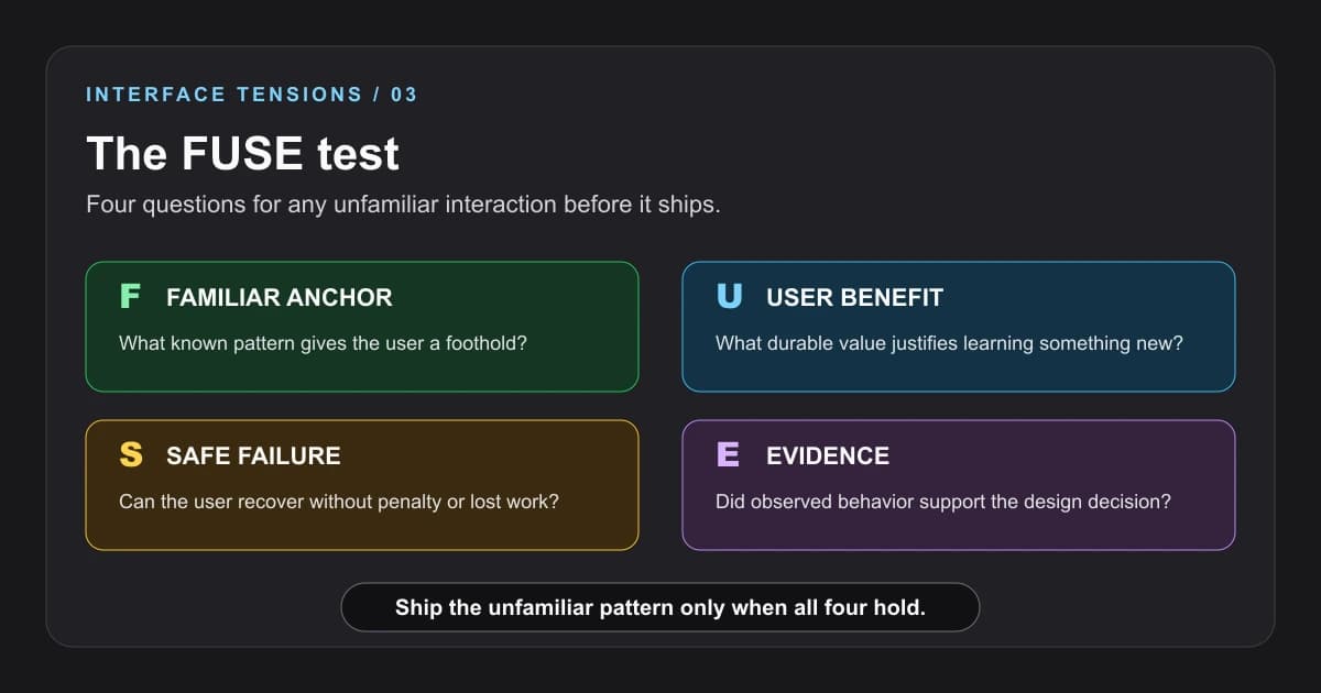
A novel interaction should not ship on enthusiasm alone. Each part of FUSE reduces a different kind of risk.
Familiar Anchor
What does the user already know that gives them a foothold?
The anchor may be a recognizable object, label, spatial relationship, or sequence. A new canvas interaction might still use familiar selection handles, undo, zoom controls, and keyboard shortcuts. An AI workflow might still present a visible plan, explicit approval, progress status, and a reviewable result.
If nothing is familiar, the product is asking the user to learn the domain and the interface at the same time.
User Benefit
What durable value justifies the learning cost?
"It feels fresh" is not enough. The change should improve speed, comprehension, control, capability, or expression in a way that matters to the intended user. The benefit should still exist after the novelty wears off.
This is the question that protects a team from confusing attention with usefulness.
Safe Failure
What happens when the user's prediction is wrong?
Can they undo the action? Is lost work restored? Does the interface explain the result? Is there a conventional alternative? Does keyboard navigation reach the same outcome? Can a user leave the experiment without being trapped?
Unfamiliarity increases the chance of incorrect prediction. Recovery is part of the design, not a later edge case.
Evidence
What did people actually do?
Ask participants what they think will happen before they act. Watch for hesitation, repeated scanning, accidental activation, Back behavior, abandonment, and recovery. Compare completion time and error patterns against the conventional alternative. Test with people who did not sit through the design process.
The most revealing question is often not "Do you like it?" It is "What would you do next, and what do you expect to happen?"
Preference can reward visual novelty. Prediction reveals whether the interaction has become understandable.
A Practical Review for Design and Engineering Teams
The familiar-versus-novel decision should not live only in a design critique. It affects implementation, content, accessibility, analytics, and support.
Before committing to an unfamiliar pattern, I would ask the team to review it from five angles:
- Product: What user problem requires a different interaction?
- Design: Which existing mental model are we preserving, extending, or replacing?
- Engineering: What additional state, feedback, fallback, and recovery does the new behavior require?
- Accessibility: Can the same intent be perceived and operated through keyboard, touch, zoom, and assistive technology?
- Research: What observation would cause us to revise or remove the pattern?
This review changes the conversation. Instead of debating whether a concept is exciting or boring, the team discusses where the interaction spends attention and what return it creates.
It also makes implementation more honest. Novel interactions are rarely just a front-end flourish. They create new states, new explanations, new failure modes, and new testing responsibilities. If the team is unwilling to fund those responsibilities, it has not funded the interaction.
The Familiar Core, Novel Edge Principle
The strongest balance I have found is a familiar core with a novel edge.
The familiar core helps people enter, navigate, understand state, perform common actions, and recover. The novel edge gives the product its particular advantage, expression, or way of working. It is noticeable because the rest of the interface is not competing for the same attention.
That balance is especially important as interfaces absorb AI-generated suggestions, autonomous actions, spatial tools, richer collaboration, and more adaptive behavior. New capability will require new patterns. It does not require us to discard every convention around those patterns.
An AI system can propose a new kind of plan while still using familiar approval controls. A design tool can introduce a new manipulation model while preserving undo and visible selection. A research experience can invite exploration while keeping location, progress, and exit clear.
Innovation works better when users have somewhere stable to stand.
Final Takeaway
Familiarity is not the enemy of creativity. It is the infrastructure that lets creativity matter.
Use conventions for the parts of an interface that should disappear into competence. Use novelty where the product creates a capability, expression, or experience worth learning. Separate visual originality from behavioral change. Protect high-risk tasks with predictable controls. Give unfamiliar patterns a familiar anchor, a durable benefit, safe recovery, and evidence.
The goal is not to make every interface feel like everything that came before it. The goal is to avoid charging users for differences that do not improve their experience.
Borrow the instincts people already have. Invent where the product has earned it.
References
Budiu, R. (2024, January 15). Memory recognition and recall in user interfaces. Nielsen Norman Group.
Chan, M. (2024, January 26). Mental models and user experience design. Nielsen Norman Group.
Budiu, R. (2016, October 30). The power law of learning: Consistency vs. innovation in user interfaces. Nielsen Norman Group.
World Wide Web Consortium. (n.d.). Understanding Success Criterion 3.2.3: Consistent navigation. Web Accessibility Initiative.
Zajonc, R. B. (1968). Attitudinal effects of mere exposure. Journal of Personality and Social Psychology, 9(2, Pt. 2), 1-27.
FAQ
What is the difference between familiar and novel interface design?
Familiar interface design uses patterns people already recognize, which lowers learning and prediction costs. Novel interface design introduces a new visual, structural, or behavioral pattern. Novelty is most defensible when it enables a capability or experience that familiar patterns cannot express as well.
What is a novelty budget in UI/UX design?
A novelty budget is my way of treating unfamiliarity as a limited product resource. Every new interaction asks users to spend attention and learning effort. A team should reserve that cost for the parts of the product that create durable value and keep commodity tasks predictable.
When should a designer break a familiar UI convention?
Break a convention when the existing pattern cannot support the product's core capability, repeated use will repay the learning cost, exploration is part of the task, or the new pattern creates useful differentiation. The change should still include clear feedback, recovery, accessibility, and evidence from user behavior.
Does following conventions make every product look the same?
No. Conventions define expectations about meaning and behavior, not a single visual style. Typography, composition, motion, imagery, pacing, and brand voice can create a distinct experience while navigation, forms, and recovery remain familiar.
How can teams test an unfamiliar interaction?
Ask users what they expect before they act, then observe hesitation, errors, recovery, abandonment, and repeated use. Compare the unfamiliar pattern with a conventional alternative. The FUSE test adds four gates: a familiar anchor, a meaningful user benefit, safe failure, and evidence.
Share this article

Ryan VerWey
Full-stack developer, Army veteran, and founder of Echo Effect LLC. His experience timeline documents current Ratespedia CTO work, Department of War contractor work, and prior Army service. More about Ryan or see the work.
Recommended Reading
The Confidence Trap: Cognitive Bias on Both Sides of the Screen
Cognitive bias shapes users and the teams building for them. Learn to question interface framing, test assumptions, and separate confidence from evidence.
The Decision Tax: When More Options Make an Interface Worse
Choice overload is not a magic number. Learn how to structure options, comparisons, defaults, and filters so users can choose with confidence.
The Invisible Work: Designing for Cognitive Load
A developer's guide to cognitive load: expose hidden mental work, preserve task context, and build interfaces that support understanding without hiding decisions.