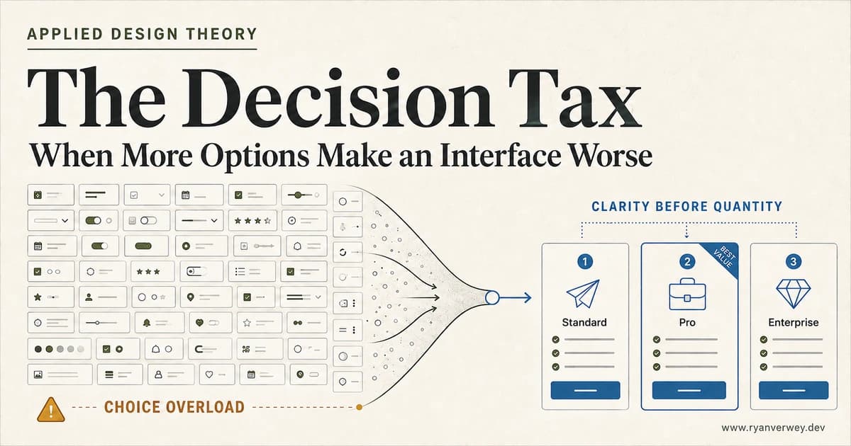
The Decision Tax: When More Options Make an Interface Worse
Choice overload is not a magic number. Learn how to structure options, comparisons, defaults, and filters so users can choose with confidence.
Choice overload is not the presence of many options. It is the point where an interface asks a person to do more comparison work than the decision feels worth.
That distinction matters. A catalog with 10,000 products can feel manageable when search, filters, categories, recommendations, and comparison tools reduce the active decision to a useful set. A pricing page with four plans can feel overwhelming when the names are vague, features are inconsistent, and every card claims to be the best value.
The design problem is not simply quantity. It is decision work: how much effort users must spend understanding the choice, comparing alternatives, predicting consequences, and feeling confident enough to act.
I call that accumulated effort the decision tax. Every option adds potential value, but it can also add discovery, comparison, uncertainty, and regret. Good choice architecture preserves meaningful agency while reducing the tax required to use it.
This second entry in my Applied Design Theory series explains when choice overload is likely, why it is related to but different from Hick's Law, and how I use the SCOPE review to design better pricing pages, filters, onboarding flows, settings, and product selections.
Choice Overload Is a Mismatch, Not a Number
Choice is usually valuable. It lets people express preferences, adapt a product to their situation, and avoid being forced into an unsuitable default. Removing all choice is not simplicity. It is control taken away from the user.
Overload begins when the demands of the decision exceed the support provided by the interface. The same set of options can be easy for one person and exhausting for another because the user, task, consequences, and presentation have changed.
Consider three people choosing a camera:
- A professional photographer arrives with a specific mount, sensor requirement, and budget. A large catalog helps because their preferences are already formed.
- A first-time buyer knows they want better family photos but does not understand lenses, sensor formats, or stabilization. The same catalog creates a vocabulary problem before it creates a product decision.
- A traveler needs a replacement before a flight. Even with strong product knowledge, time pressure makes a large comparison set expensive.
The number of cameras did not change. The decision did.
This is why rules such as "never show more than seven options" are attractive and unreliable. They convert a contextual design problem into an easy checklist. The interface may pass the checklist while leaving the actual work untouched.
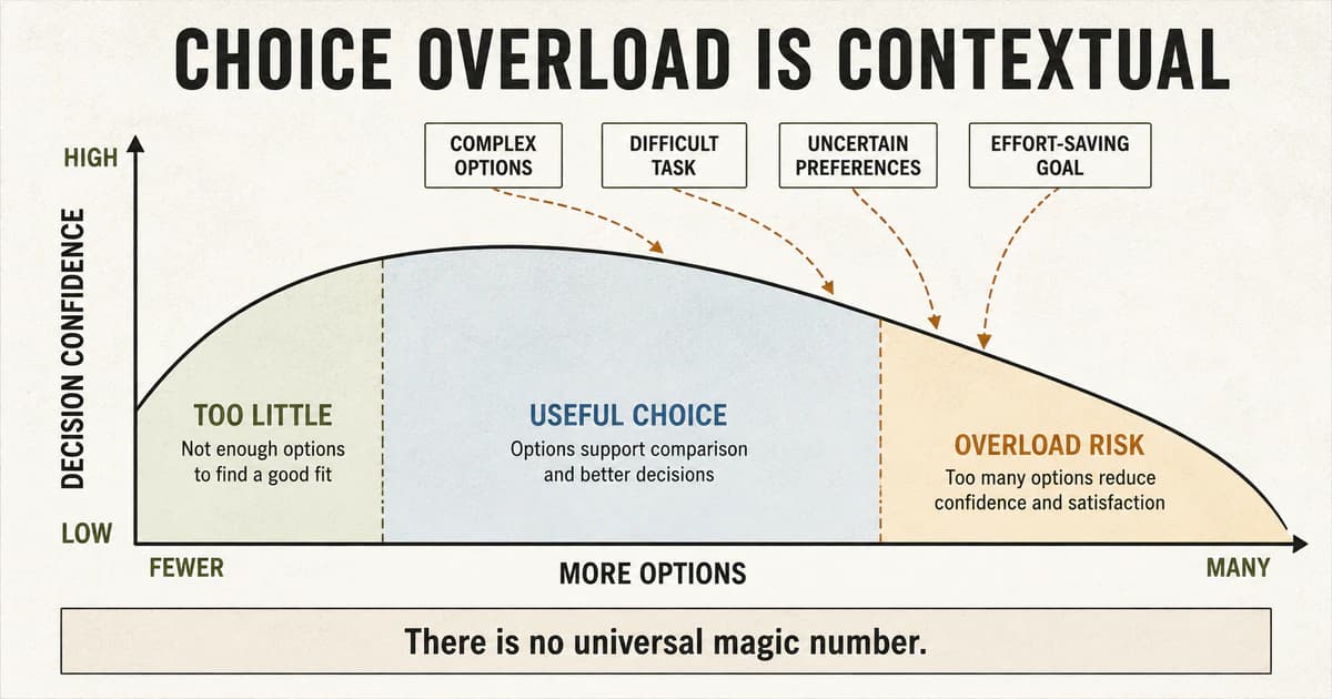
The overload threshold moves with the context. More options can improve fit until comparison cost and uncertainty begin to reduce confidence.
What the Famous Jam Study Actually Tells Us
The most repeated choice-overload story comes from Sheena Iyengar and Mark Lepper's 2000 paper, When Choice Is Demotivating. In the field experiment, shoppers encountered a display of either 24 jams or six. The larger display attracted more attention, but nearly 30 percent of people exposed to the smaller set purchased a jar, compared with about 3 percent in the larger-set condition.
The paper included two additional experiments. Students were more likely to complete an optional essay when choosing from six topics instead of 30, and participants choosing chocolates from a smaller assortment reported better experiences after the decision. Together, the studies challenged the assumption that more choice always produces more motivation and satisfaction.
The useful lesson is not that six is a perfect interface number. Jam samples, essay prompts, and chocolates share particular conditions: options are similar, the ideal choice is uncertain, comparison consumes time, and choosing the wrong item is easy to imagine after the fact.
The result is also a warning about product metrics. The large display won attention while the small display won purchasing. An interface can look engaging at the top of a funnel while making commitment harder at the bottom. Counting impressions, card opens, or time on page without measuring completion can reward the very friction the product should remove.
The Research Does Not Support a Universal Limit
Choice overload became a popular design explanation because it feels immediately true. Anyone who has stared at a wall of nearly identical televisions or compared a dozen software plans recognizes the experience. Research after the original studies, however, makes the conclusion more precise.
Scheibehenne, Greifeneder, and Todd's 2010 meta-analysis of choice-overload experiments examined 63 conditions from 50 published and unpublished experiments with 5,036 participants. The average effect was close to zero, while the variation between studies was substantial. In some contexts, larger assortments harmed decisions. In others, they helped or made little difference.
That is not evidence that choice overload is imaginary. It is evidence that assortment size alone is an incomplete explanation.
Chernev, Böckenholt, and Goodman's later conceptual review and meta-analysis analyzed 99 observations involving 7,202 participants and identified four conditions that reliably shape overload risk:
- Choice-set complexity: Options contain many attributes, attributes are difficult to compare, or alternatives are very similar.
- Decision-task difficulty: The user faces time pressure, incomplete information, uncertain consequences, or a demanding evaluation process.
- Preference uncertainty: The user does not yet know which attributes matter or how to trade one benefit against another.
- Decision goal: The user wants to minimize effort rather than invest deeply in finding an optimal result.
This gives designers a stronger model. The question is not "How many options are too many?" It is "How much unresolved decision work have we placed in front of this person?"
Choice Overload and Hick's Law Are Related, Not Interchangeable
Choice overload is often paired with Hick's Law, but they describe different outcomes.
W. E. Hick's 1952 experiments on the rate of information gain studied choice reaction time. As the uncertainty among possible stimulus-response pairs increased, reaction time increased in a predictable relationship. In interface language, selecting one item from a larger set of equally plausible actions generally takes longer than selecting from a smaller set.
Choice overload reaches beyond reaction time. It can involve postponing the decision, abandoning it, feeling less satisfied afterward, or continuing to wonder whether an unchosen option was better.
This difference changes how I apply the concepts:
- Hick's Law helps evaluate selection speed among visible actions.
- Choice overload helps evaluate motivation, confidence, completion, and satisfaction across a decision.
- Hick's Law is most direct when options are known and the task is to select.
- Choice overload becomes especially relevant when users must first understand what the options mean and decide what they value.
A navigation menu with twelve familiar destinations may slow scanning without creating meaningful overload. Three health-insurance plans can create overload because the consequences are important and the tradeoffs are difficult. Counting options without examining the decision hides that difference.
The Decision Tax
The decision tax is the total work an interface transfers to the user before they can choose with confidence. I break it into five costs.
Discovery Cost
What must the user inspect before they can form a reasonable shortlist?
Discovery cost rises when every option receives equal visual weight, labels are vague, categories reflect the company's organization instead of the user's goal, or important differences are buried in detail pages.
Search and filters can lower discovery cost, but only when their vocabulary matches what people know. A filter labeled "deployment topology" may be technically precise and useless to a buyer who thinks in terms of "works with my existing server."
Comparison Cost
How much work is required to compare the remaining options on the same dimensions?
Comparison becomes expensive when cards describe different attributes, units change, features appear in inconsistent orders, or the user must remember facts while moving between pages. A side-by-side table is useful because it externalizes memory and aligns differences. It does not help when the table contains 80 undifferentiated rows.
Interpretation Cost
Does the user understand why a difference matters?
Technical products often expose implementation details before translating their consequences. Storage, requests, seats, integrations, response time, and support levels matter only after the user can connect them to a real need. Good content gives the attribute a job instead of presenting it as a number.
Consequence Cost
How difficult or risky is it to be wrong?
Choosing a playlist theme has a low consequence cost. Selecting a billing plan, deleting data, changing permissions, or configuring a deployment has a higher one. High-consequence choices need clearer previews, stronger comparison, confirmation, reversibility, and honest explanations of what changes.
Regret Cost
How much does the interface keep unchosen alternatives psychologically active after the decision?
When every option claims a unique advantage, users can imagine a benefit they sacrificed no matter what they select. Clear tradeoffs, a transparent default, easy plan changes, and a reversible trial reduce the pressure to make a permanently perfect choice.
The decision tax explains why simply deleting options is an incomplete fix. A team can reduce six plans to three and still leave every cost in place. Better design removes unnecessary work while preserving options that represent real differences.
A Catalog Is Not a Decision Surface
One of the most useful distinctions in interface design is the difference between how many options a system supports and how many it asks the user to evaluate at once.
An online store may need a large catalog. A developer tool may support dozens of integrations. A dashboard may expose hundreds of reports. The product does not need to flatten that inventory into one visual decision.
The interface can stage the work:
- search when the user knows the target
- categories when the user recognizes a goal
- filters when attributes are understood
- guided questions when preferences are still forming
- recommendations when the reason can be explained
- comparison when a shortlist exists
- progressive disclosure when detail becomes relevant later
This is not hiding choice. It is sequencing choice while keeping the broader catalog reachable.
Comparison Is an Interface, Not a Spreadsheet Dump
When options are genuinely different, comparison is necessary. The design responsibility is to make those differences legible.
Pricing pages expose this problem clearly. Teams often add plans over time, write each card independently, attach multiple badges, and list whichever features make that tier sound strongest. The cards become advertisements rather than a comparison surface.
A useful comparison aligns the options around shared questions:
- Who is this for?
- What limit changes?
- Which capability becomes available?
- What remains the same?
- What happens if the user outgrows the choice?
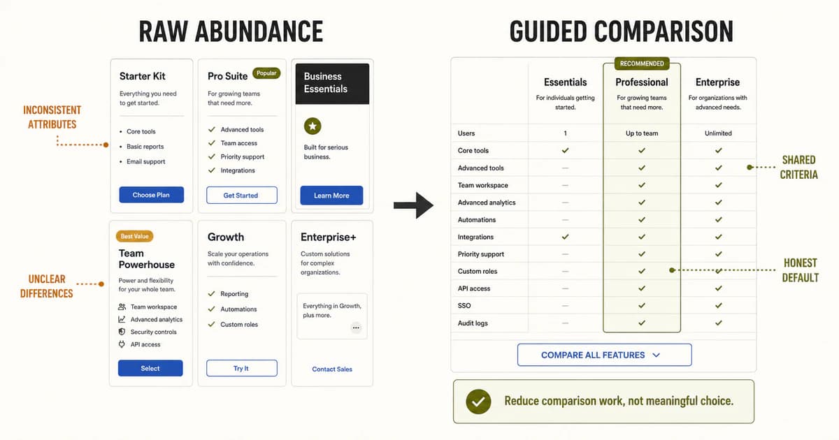
The better surface does not pretend the other choices do not exist. It gives users common criteria, an explainable recommendation, and a path to full detail.
The recommendation deserves special care. A "Most Popular" badge may reduce effort, but it can also become a dark pattern when it exists only to steer buyers toward the most profitable tier. An honest default states the reason: "Best for teams that need approvals" is more useful than "Best Value." The recommendation should help the user map a plan to a situation, not borrow authority the interface has not earned.
Preserve Agency While Reducing Work
Choice architecture becomes manipulative when simplification quietly removes meaningful alternatives or preselects the outcome that benefits the business. The goal is not to make users choose faster at any cost. The goal is to make the decision understandable.
I use five principles:
Prefer Meaningful Differences
Options should represent real tradeoffs. If two plans differ only because the product team wants another price anchor, the interface inherits comparison work without adding meaningful agency.
Before designing cards, ask whether each option deserves to exist. Information architecture cannot permanently repair a weak product architecture.
Give the User a Starting Point
A featured option, saved configuration, sensible default, or short guided question can reduce the blank-page problem. The starting point should be transparent and reversible.
Defaults are especially powerful, which means they require restraint. Use them to express a safe, common choice, not to sneak consent, upgrades, or recurring charges past the user.
Make Tradeoffs Comparable
Use consistent labels, units, order, and levels of detail. Keep the attributes people use to decide visible together. Move secondary specifications behind expansion only after the primary differences are clear.
Let People Narrow Before They Compare
Filtering is not merely a catalog feature. It is a decision-making tool. Good filters remove irrelevant options based on criteria the user understands and preserve the state so the user can revise the shortlist without starting over.
This is one reason I prefer semantic, URL-backed filters for substantial content and product collections. They make the current decision state visible, navigable, and shareable. When implemented server-side, they can also preserve crawlable source content while keeping filtered utility URLs out of the index through deliberate canonical and robots behavior.
Keep the Full Set Reachable
Progressive disclosure should reduce immediate demand without creating a dead end. "Show all," "Compare features," and removable filter chips give people control over how much complexity they want to take on.
The interface should support both the person who wants guidance and the expert who already knows what they need.
The SCOPE Review
Before I ship a decision-heavy interface, I review it through five questions: Set, Compare, Organize, Progressively reveal, and Enable narrowing.
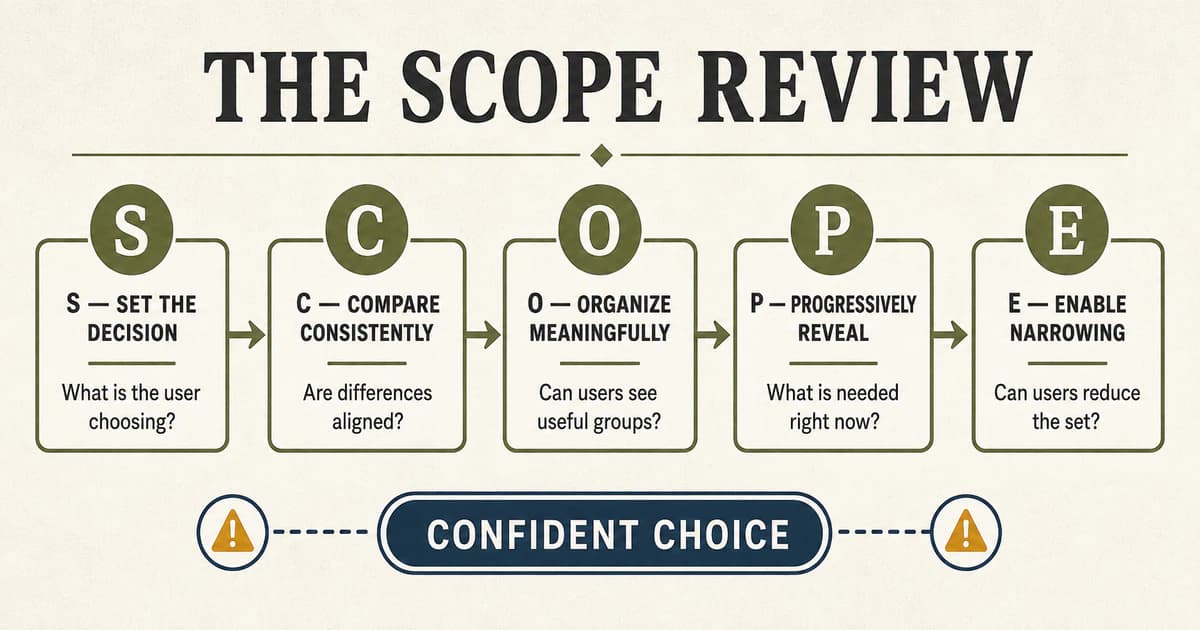
SCOPE is not a rule for making every interface smaller. It is a review for making the user's decision clearer.
S: Set the Decision
What is the user actually choosing?
This sounds obvious, but interfaces often mix several decisions in one surface. A checkout may ask the user to select shipping speed, insurance, gift options, payment method, account creation, and marketing consent without separating their purposes.
Write the decision as one sentence: "Choose the plan that supports your team size and approval needs." If the sentence needs several unrelated clauses, the interface may need stages.
C: Compare Consistently
Can alternatives be evaluated on shared dimensions?
Normalize the data before designing the cards. If one product lists capacity, another lists speed, and a third lists compatibility, visual polish will not make them comparable. Define the decision attributes, units, missing-value behavior, and display order as part of the product model.
Consistency also matters for accessibility. Repeated structures should preserve heading order, label controls clearly, and avoid making color or position the only signal for a difference.
O: Organize Meaningfully
Can users recognize useful groups before inspecting every item?
Group by user goal, task, compatibility, or another distinction that helps eliminate irrelevant options. Avoid categories that exist only because they mirror internal departments or database fields.
Organization should reduce scanning without implying false exclusivity. A tool can belong to more than one useful category when the underlying model supports it.
P: Progressively Reveal
What information is required for this stage of the decision?
Show enough to understand the tradeoff, then provide detail on demand. Progressive disclosure fails when essential costs, restrictions, or consequences are hidden behind interaction. It also fails when the collapsed label is too vague to predict what it contains.
The right test is not whether content fits above the fold. It is whether the user can make the next decision without carrying unnecessary information in working memory.
E: Enable Narrowing
Can users reduce the set using criteria they understand?
Search, filters, sort controls, guided questions, and comparison trays serve different forms of intent. Search supports a known target. Filters support known attributes. Guided questions help form preferences. Comparison supports a shortlist.
Do not force one control to perform every job. A search field cannot replace a useful category system, and dozens of filters cannot help someone who does not know what the attributes mean.
Building Choice Architecture in the Front End
Choice overload is not solved only in a design file. The implementation determines whether the support survives real content, responsive layouts, assistive technology, and changing product data.
Model Options Around Comparable Attributes
Use structured data for the facts that drive comparison. A pricing tier should not store its entire meaning in an arbitrary marketing paragraph. Team size, limits, included capabilities, support level, and upgrade behavior should be fields that can be rendered consistently.
Structured attributes also make it possible to test missing values, prevent contradictory claims, generate accessible tables, and reuse the same source across cards, comparison views, and metadata.
Keep Filter State Understandable
The selected state should survive navigation, refresh, and sharing when the task benefits from it. URL parameters are often appropriate for filters, but they need deliberate SEO handling. The canonical collection remains the indexable source while utility combinations can be noindex, follow when they do not represent distinct search destinations.
This avoids solving a UX problem by creating an indexing problem.
Use Native Controls
Native selects, checkboxes, radio groups, buttons, and links provide semantics and keyboard behavior that custom clickable containers must rebuild. A plan card can be visually rich while its selection control remains a real radio input with a visible label.
For progressive disclosure, the trigger needs an accessible name, an expanded state, and predictable focus behavior. For comparison tables, row and column headers need semantic relationships. For recommendations, the reason must be available as text, not only a colored badge.
Design the Small Screen as a Decision Sequence
A desktop comparison table cannot simply shrink until it becomes unreadable. On mobile, preserve the shared criteria and let users compare a small number of options at a time. Sticky option headers, a two-item comparison tray, or criterion-by-criterion sections can maintain context without forcing horizontal memory.
Responsive design should change the presentation, not erase the information needed to choose.
How to Measure Choice Overload
Overload is easy to label after a design review and harder to prove. I look for a pattern across behavior rather than one metric.
Useful signals include:
- Time to first meaningful action: How long does it take to begin narrowing or comparing?
- Decision completion: Do people finish, postpone, or abandon the choice?
- Backtracking: How often do users reopen options or repeat the same comparison?
- Selection volatility: How frequently does the choice change before commitment?
- Support-tool use: Are filters, comparisons, recommendations, or guided questions helping?
- Errors and reversals: Do people immediately undo, downgrade, cancel, or contact support?
- Confidence: Can users explain why their selected option fits their needs?
In moderated research, I ask participants to state their decision criteria before they begin. If they cannot, I watch whether the interface helps them form those criteria or simply makes them inspect more cards.
The experiment should compare decision support, not only assortment size. Test a raw set against grouped options, aligned comparison, guided narrowing, or a transparent default. That tells the team which form of support reduces the tax without removing needed choice.
When More Choice Is the Better Design
Large assortments can be a feature when the interface and context support them.
More choice is useful when:
- users arrive with clear preferences or a known target
- meaningful variation exists across the audience
- search and filters quickly remove irrelevant options
- experts need precision or control
- the task is repeated and users can build fluency
- alternatives are easy to compare on stable attributes
- choosing incorrectly is inexpensive or reversible
The right move is often layered access: a strong default for common needs, guided controls for developing preferences, and complete control for experts.
That is the same principle I use in The Novelty Budget. Familiar structure creates a stable core. Product-specific capability can live at the edge. Here, the stable core is a comprehensible decision, and the edge is the breadth of choice the product genuinely needs to support.
A Practical Team Review
Before release, I ask the team to answer these questions together:
- Product: Which options represent meaningful differences, and which exist for internal reasons?
- Design: Can a user identify the decision and the primary tradeoffs without opening every option?
- Content and engineering: Are labels clear and attributes structured consistently enough for comparison?
- Accessibility: Can people compare without relying on pointer precision, color, or visual memory?
- Research and analytics: Are we measuring confident completion, reversals, and abandonment instead of attention alone?
This keeps choice overload from becoming a cosmetic diagnosis. A confusing surface may expose inconsistent tiers, missing content strategy, or weak data modeling. The interface is often where organizational ambiguity becomes visible.
Final Takeaway
More choice is not automatically empowering, and less choice is not automatically usable.
Choice overload appears when the interface presents more unresolved comparison, interpretation, consequence, and regret than the user can justify for the task. The threshold moves with the person, the options, the stakes, and the support built around the decision.
Do not chase a magic number. Define the decision. Align the differences. Organize around user goals. Reveal detail when it becomes useful. Give people tools to narrow the set, and keep the broader choice reachable when it represents real value.
The goal is not to choose for the user. It is to stop charging them unnecessary work for the right to choose.
References
Chernev, A., Böckenholt, U., & Goodman, J. (2015). Choice overload: A conceptual review and meta-analysis. Journal of Consumer Psychology, 25(2), 333-358.
Hick, W. E. (1952). On the rate of gain of information. Quarterly Journal of Experimental Psychology, 4(1), 11-26.
Iyengar, S. S., & Lepper, M. R. (2000). When choice is demotivating: Can one desire too much of a good thing?. Journal of Personality and Social Psychology, 79(6), 995-1006.
Scheibehenne, B., Greifeneder, R., & Todd, P. M. (2010). Can there ever be too many options? A meta-analytic review of choice overload. Journal of Consumer Research, 37(3), 409-425.
Toffler, A. (1970). Future shock. Random House.
FAQ
What is choice overload in UI/UX design?
Choice overload is the decline in motivation, confidence, completion, or satisfaction that can occur when a decision requires more comparison work than a user can comfortably manage. It depends on the complexity of the options, the task, the user's preferences, and the consequences, not only the number of choices.
Is choice overload the same as the paradox of choice?
The terms are often used interchangeably. Both describe situations where additional options can make choosing harder or less satisfying. In interface work, "choice overload" is useful because it focuses attention on observable decision behavior and the conditions producing it.
How is choice overload different from Hick's Law?
Hick's Law describes how decision time changes as uncertainty among possible responses increases. Choice overload concerns broader outcomes such as deferral, abandonment, confidence, regret, and satisfaction. A selection can take longer without becoming overload, and a small high-stakes set can create overload even when it contains few options.
How many options should an interface show?
There is no universal limit. Show enough options to represent meaningful differences, then reduce decision work through grouping, consistent comparison, progressive disclosure, defaults, search, and filtering. Test whether users can explain and complete the decision confidently.
Do filters solve choice overload?
Filters help when users understand the attributes and can identify what matters. They are less useful when preferences are still forming or labels use unfamiliar language. In those cases, guided questions, recommendations with reasons, and clear categories may provide a better starting point.
What is the SCOPE review?
SCOPE is my five-part review for decision-heavy interfaces: Set the decision, Compare consistently, Organize meaningfully, Progressively reveal detail, and Enable narrowing. It is designed to reduce unnecessary decision work without removing meaningful user choice.
Share this article

Ryan VerWey
Full-stack developer, Army veteran, and founder of Echo Effect LLC. His experience timeline documents current Ratespedia CTO work, Department of War contractor work, and prior Army service. More about Ryan or see the work.
Recommended Reading
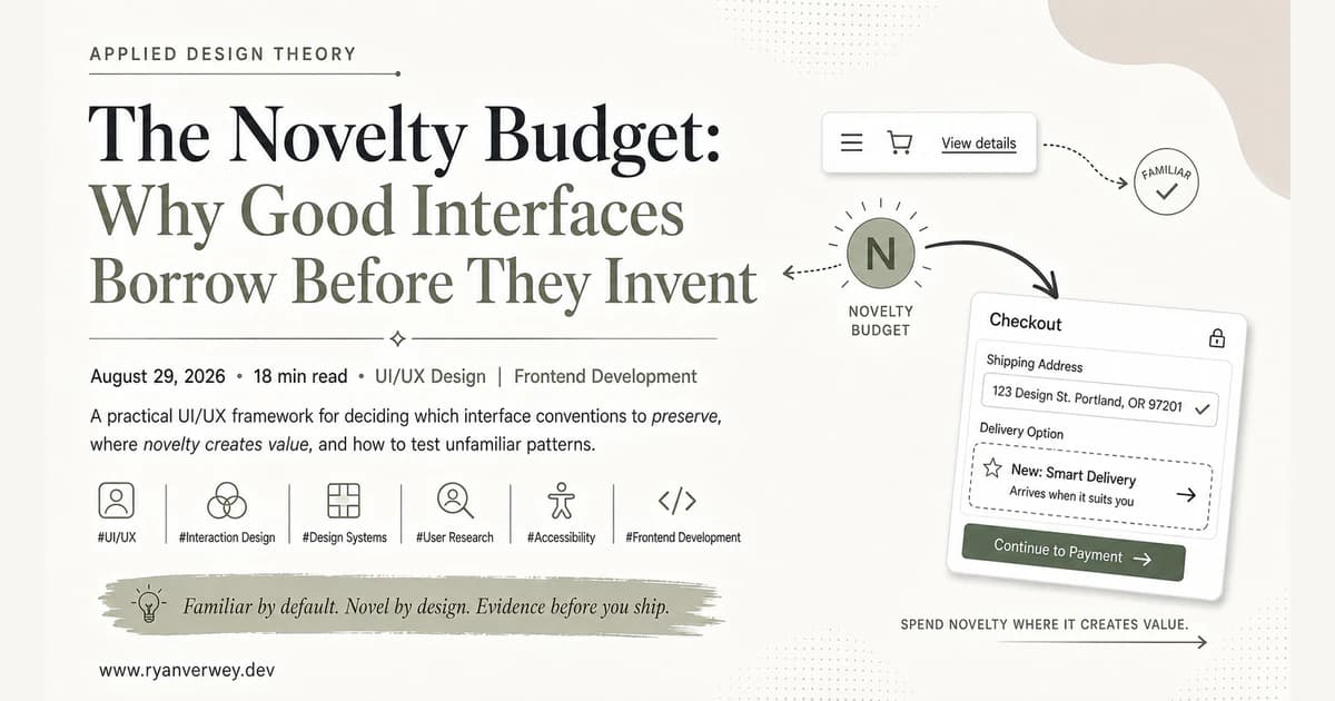
The Novelty Budget: Why Good Interfaces Borrow Before They Invent
A practical UI/UX framework for deciding which interface conventions to preserve, where novelty creates value, and how to test unfamiliar patterns.
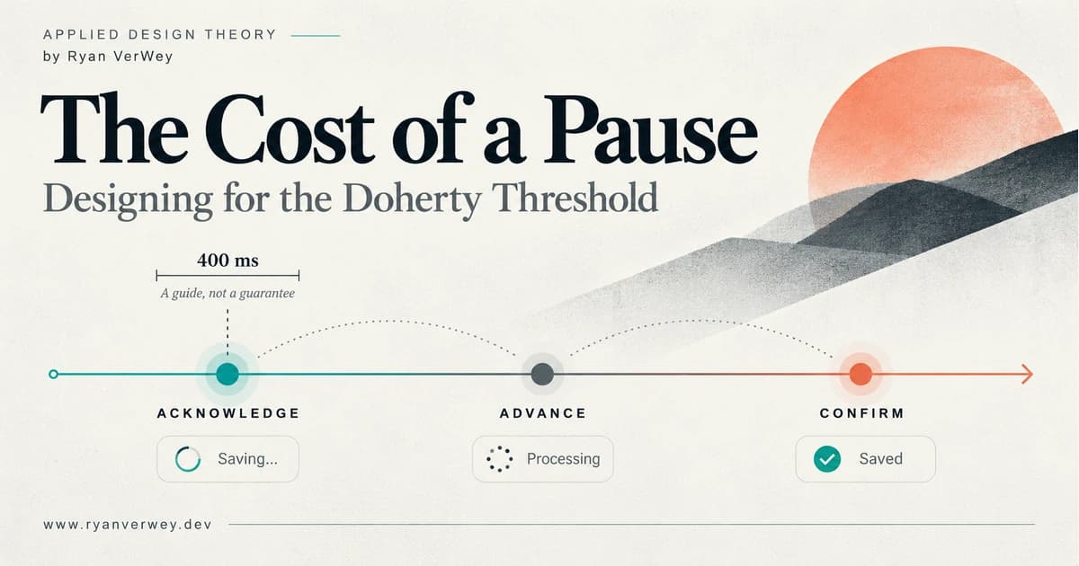
The Cost of a Pause: Designing for the Doherty Threshold
A developer's guide to the Doherty Threshold: build responsive feedback, honest progress, and reliable recovery without confusing speed with completion.
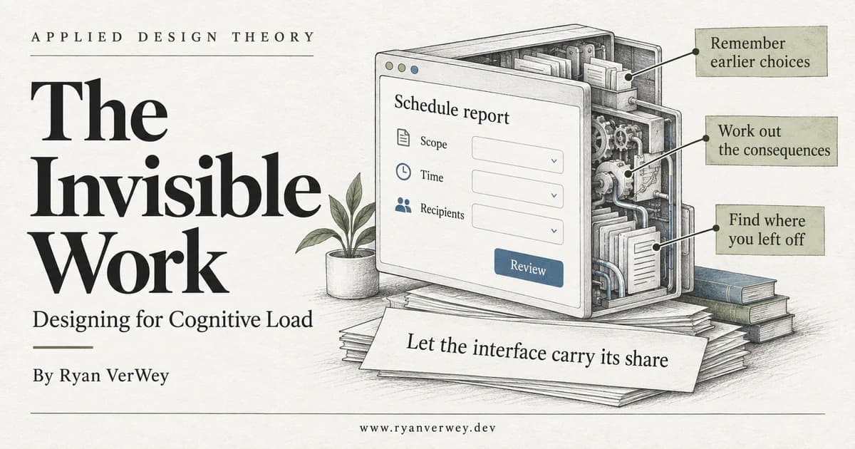
The Invisible Work: Designing for Cognitive Load
A developer's guide to cognitive load: expose hidden mental work, preserve task context, and build interfaces that support understanding without hiding decisions.